Sojourn Serai
An identity for a longer kind of journey.
- Industry
- Travel & hospitality
- Growth stage
- Pre-launch
Challenge
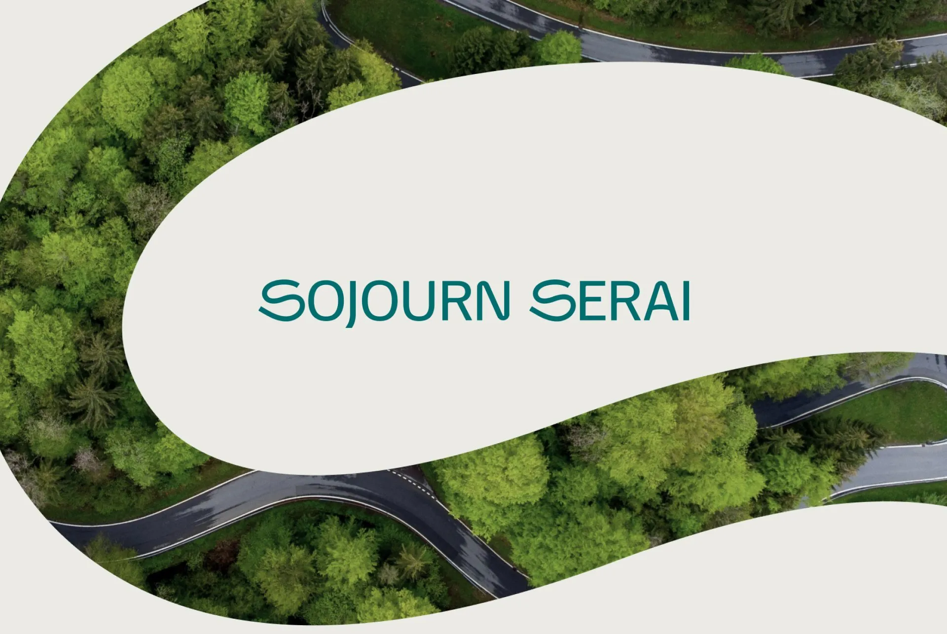
Sojourn Serai was preparing to launch an accommodation platform for long-stay travellers and digital nomads. It needed a visual identity that reflected the experience it wanted to offer: somewhere people could settle in and enjoy being away.
The brief called for a balance of flexibility, playfulness, and calm, giving the platform a welcoming character from its first introduction.
Identity
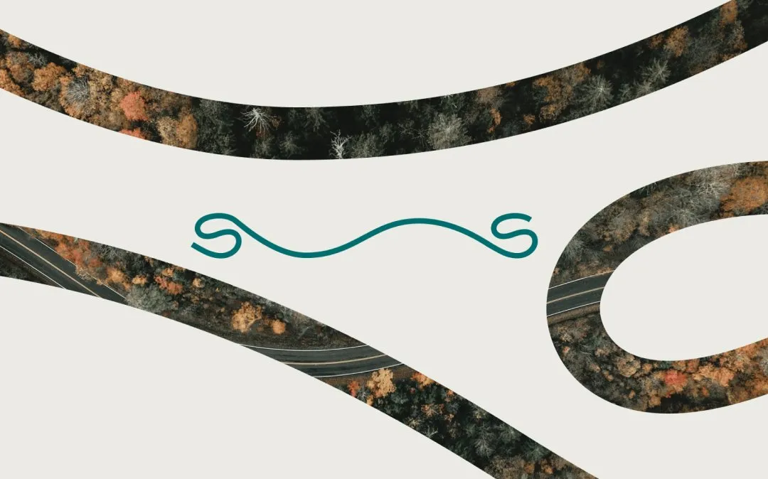
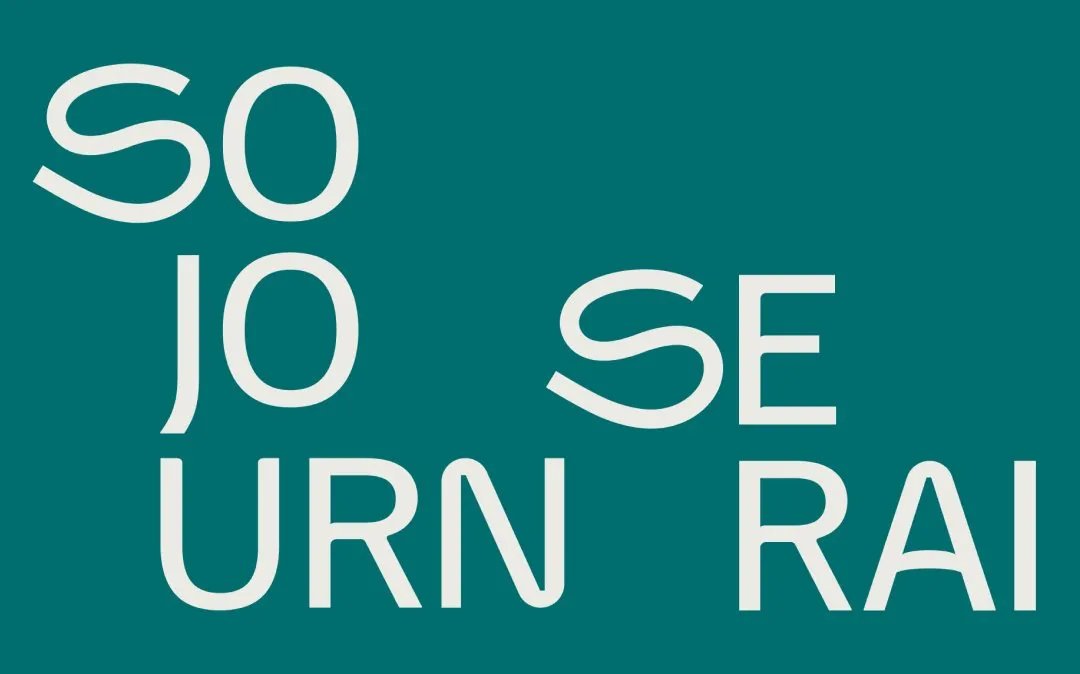
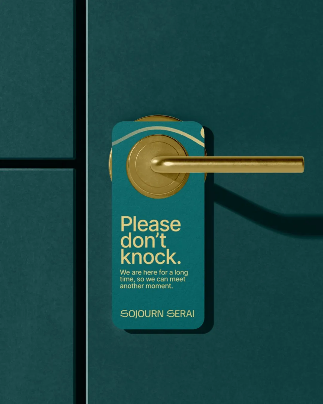
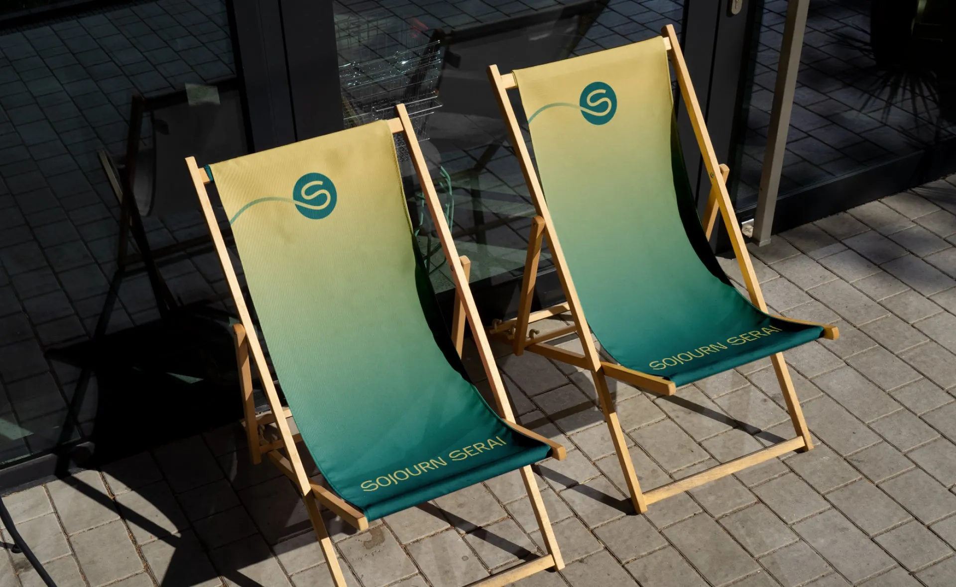
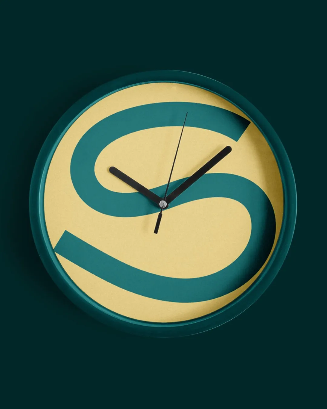
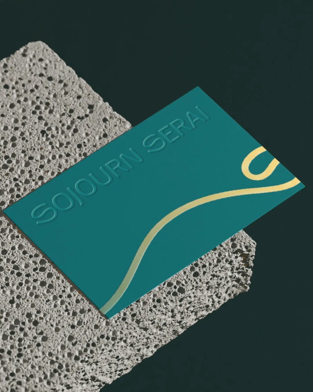
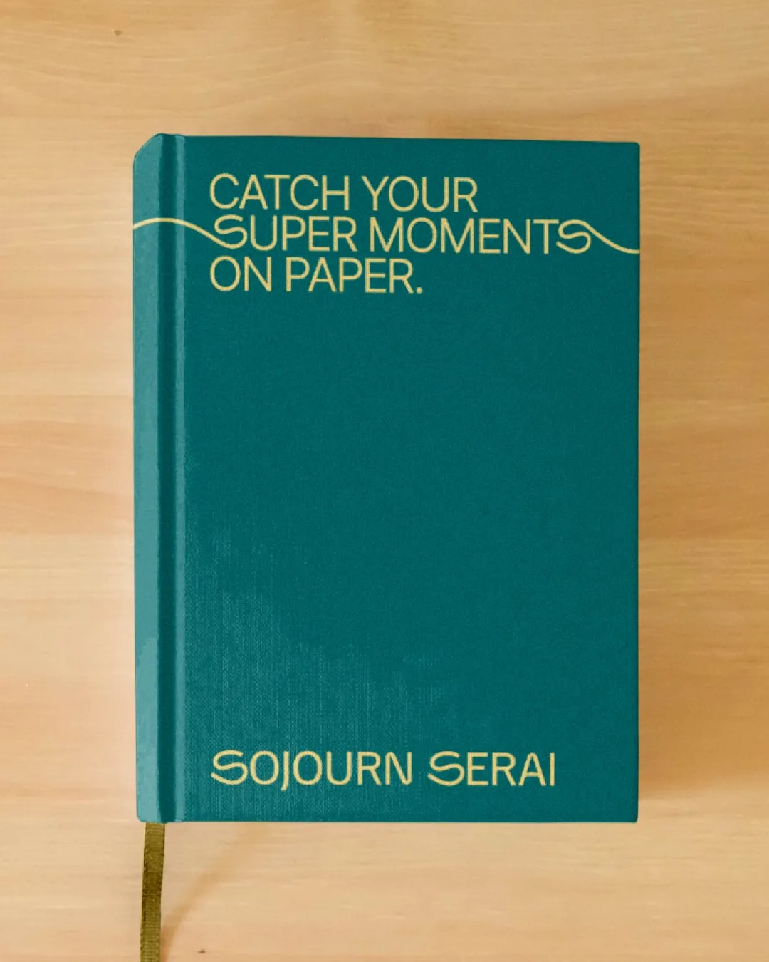
We took the journey as our starting point. The letter S became a winding road, bringing the idea of travel directly into the wordmark. The remaining letterforms were customised to follow its character, connecting the name through a shared visual style.
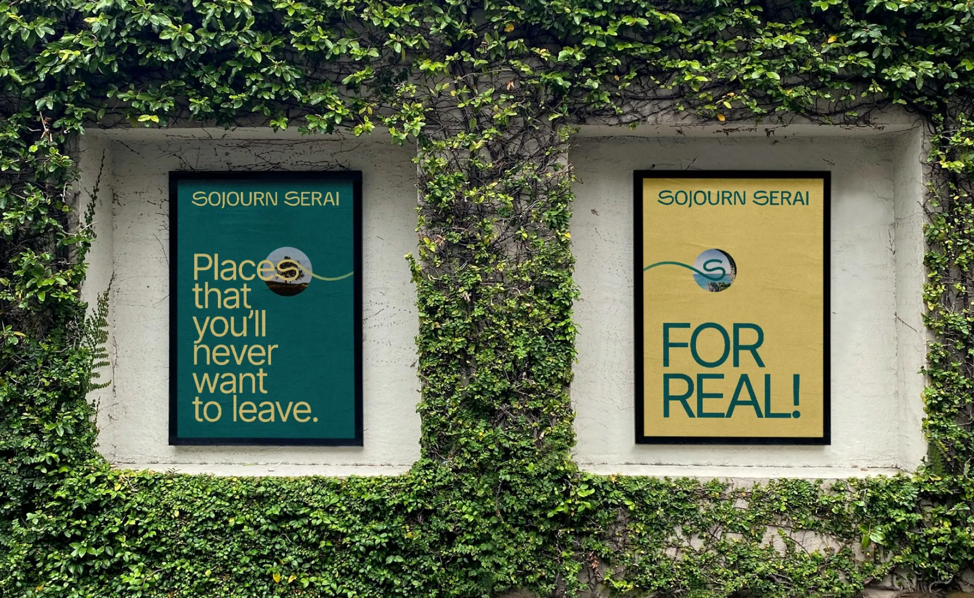
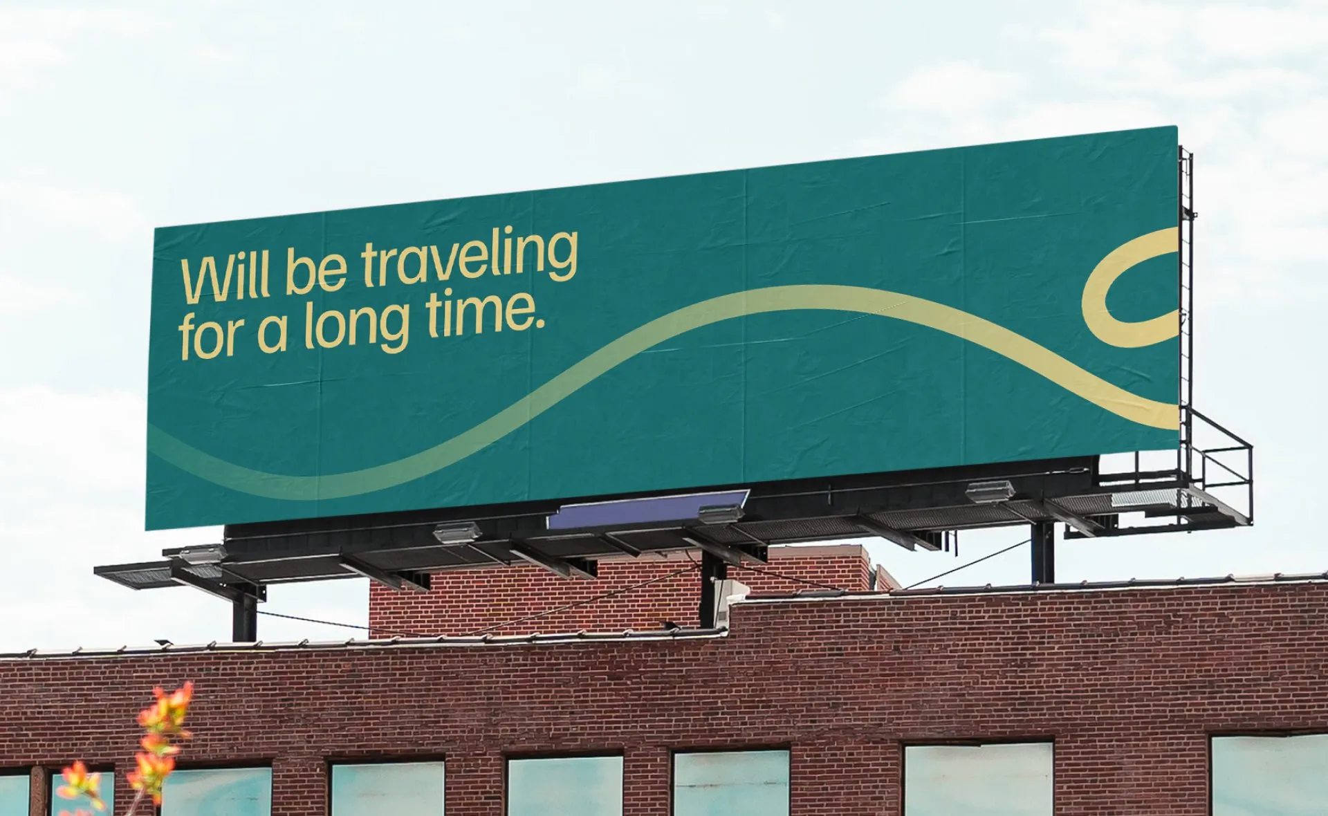
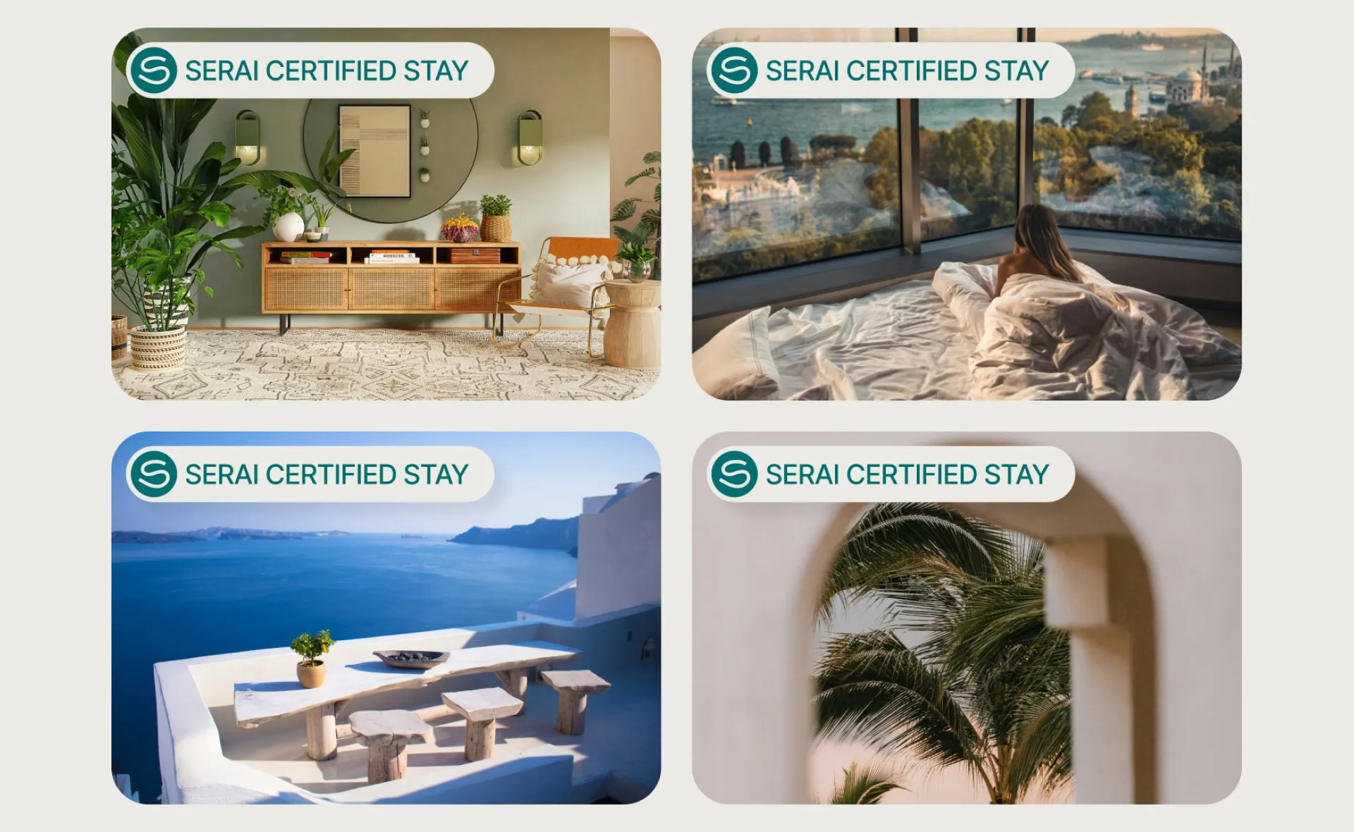
That curve became the basis of the wider system. It could stand alone as a symbol, frame photography, or move through a layout as a graphic element. One recognisable shape gave the brand different ways to express itself.
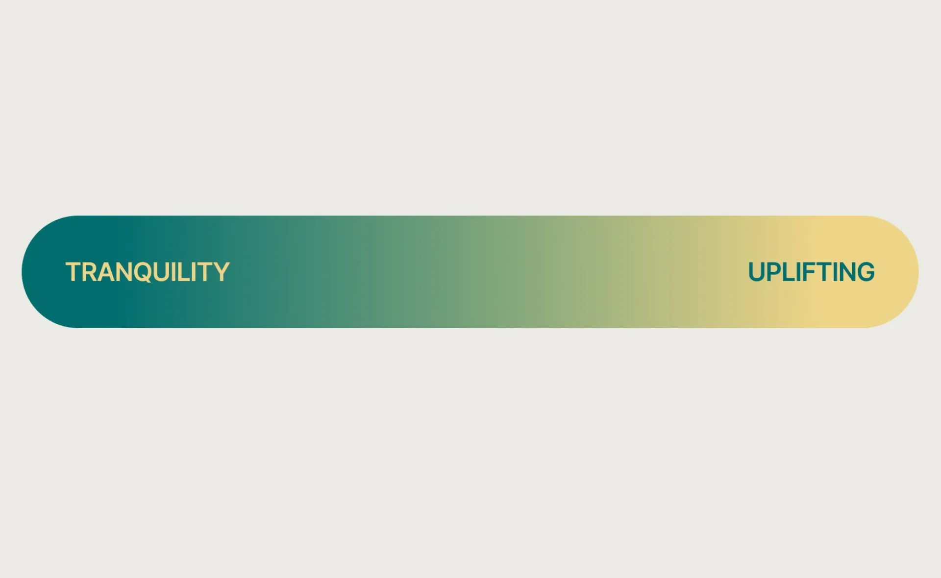
A palette moving from teal to soft yellow complemented the curved forms, balancing a relaxed feeling with a sense of possibility. Together, the elements gave Sojourn Serai a playful, unhurried presence.
Outcome
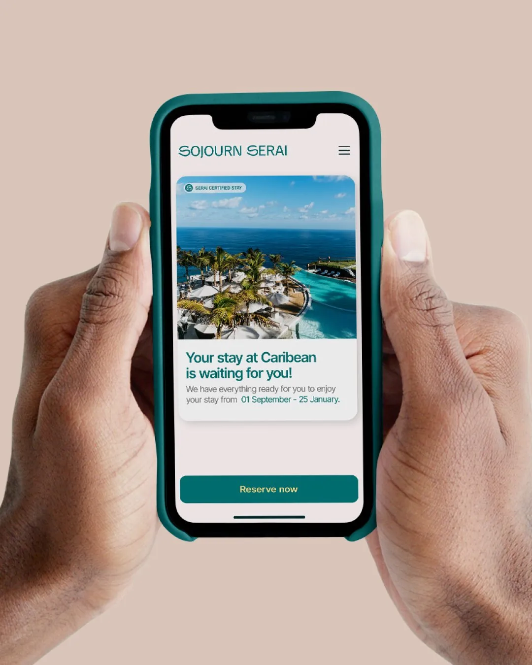
Sojourn Serai gained a visual identity built around its audience and its approach to travel. The wordmark, road-like symbol, and flexible graphic language gave the team a consistent foundation for introducing the platform and carrying its character across brand applications.
Read similar case studies
Alphatechs
A stronger presence for a cybersecurity company ready to grow.
Vetch Studio
A studio rooted in the work it serves.
Kalemi
Giving the company behind the products a presence of its own.