Sphere
An identity built to move with threat intelligence.
- Industry
- Cybersecurity SaaS
- Growth stage
- Early-stage startup
Challenge
Sphere was preparing to enter the cybersecurity market. Developed by Alphatechs, the SaaS product had an MVP being tested with real users and a launch ahead of it. Having worked with Alphatechs before, we were brought in to build the brand for this next step.
The team needed an identity that would help people take a new product seriously. In a market where businesses are choosing whom to trust with their security, the way Sphere presented itself would shape those early conversations. Our task was to give the product a clear, credible presence that could support the sales process.
Direction
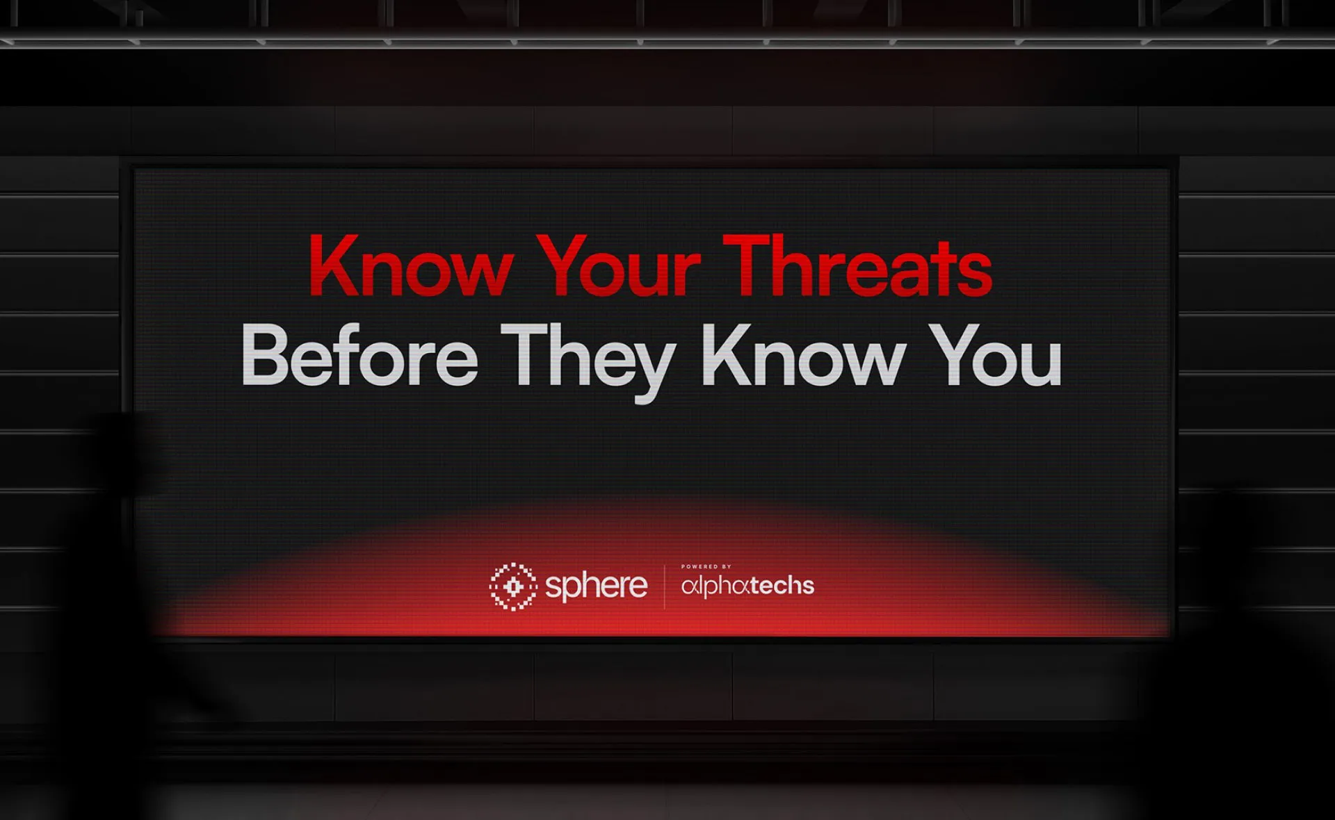
Sphere’s promise gave us a direction: “Know your threats before they know you.” The product gathered intelligence to help businesses understand risk. As its findings developed, so did the picture it presented. We saw an opportunity to bring that idea into the identity, making the brand’s behaviour reflect the intelligence behind the product.
Brand
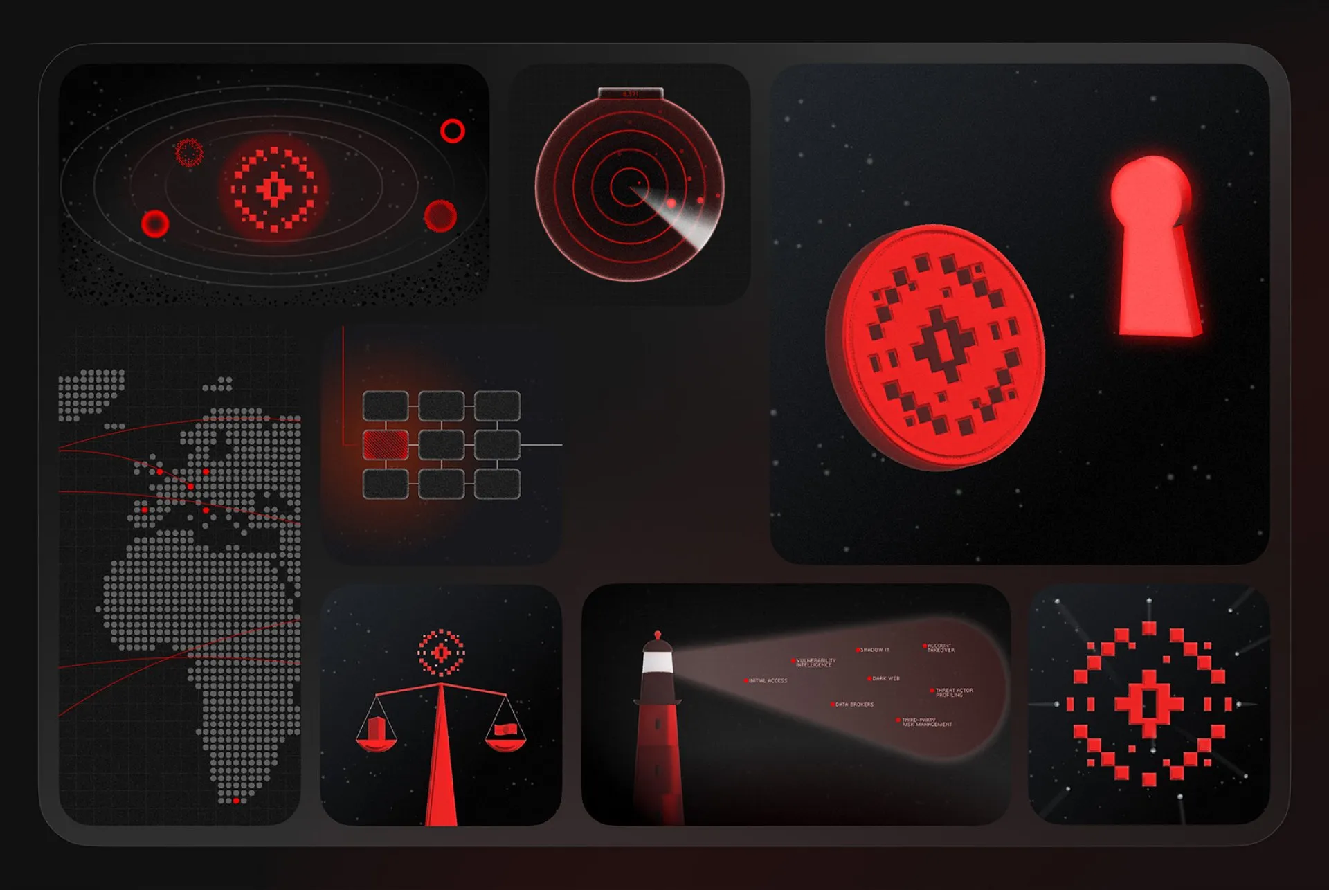
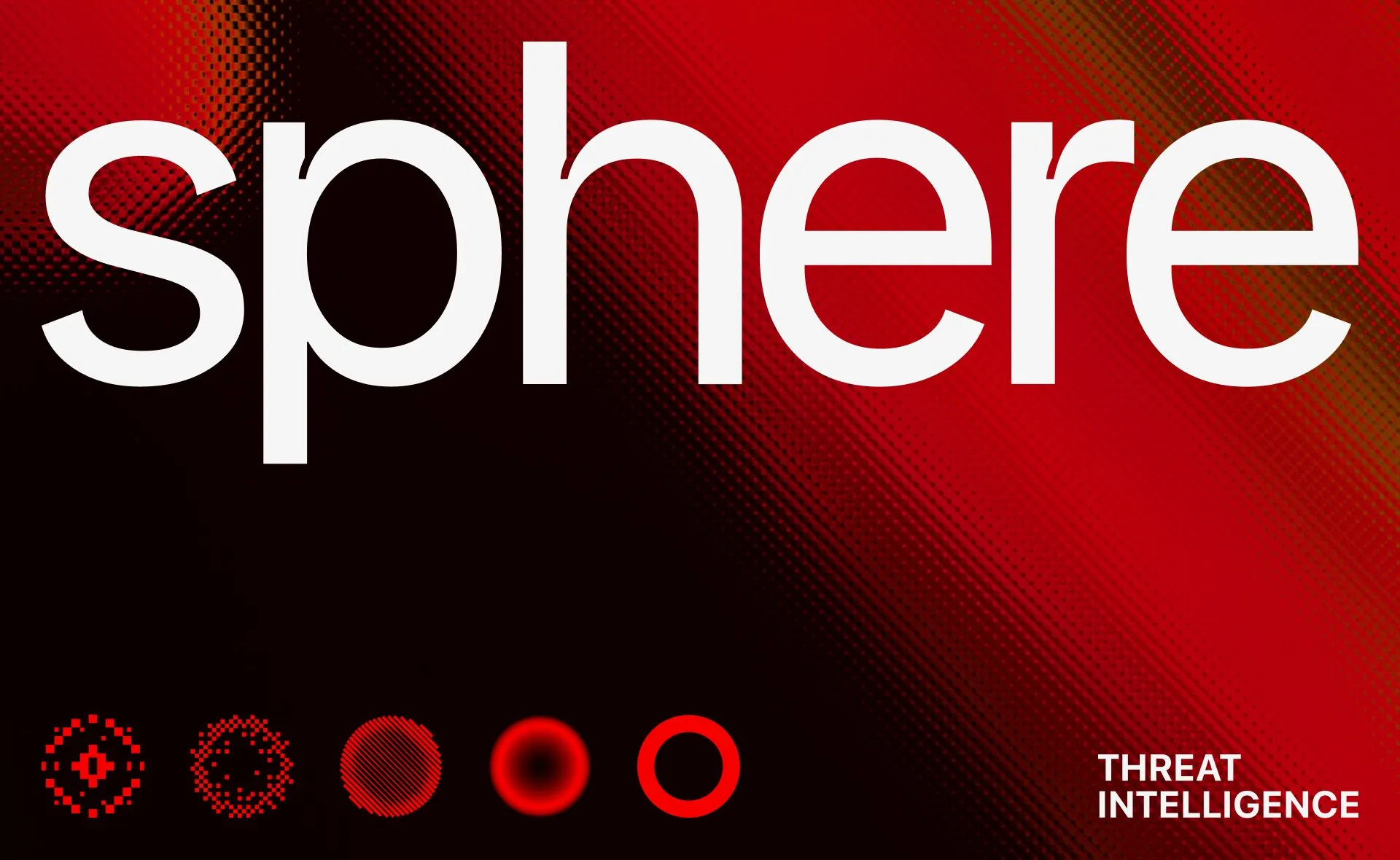
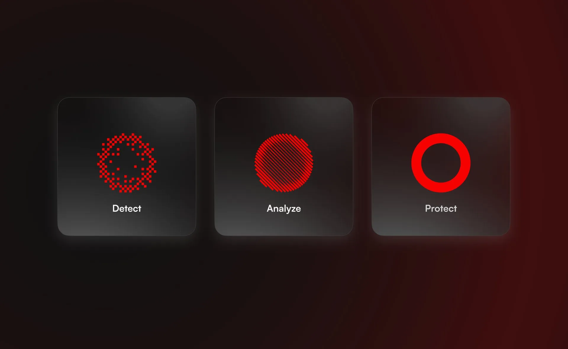
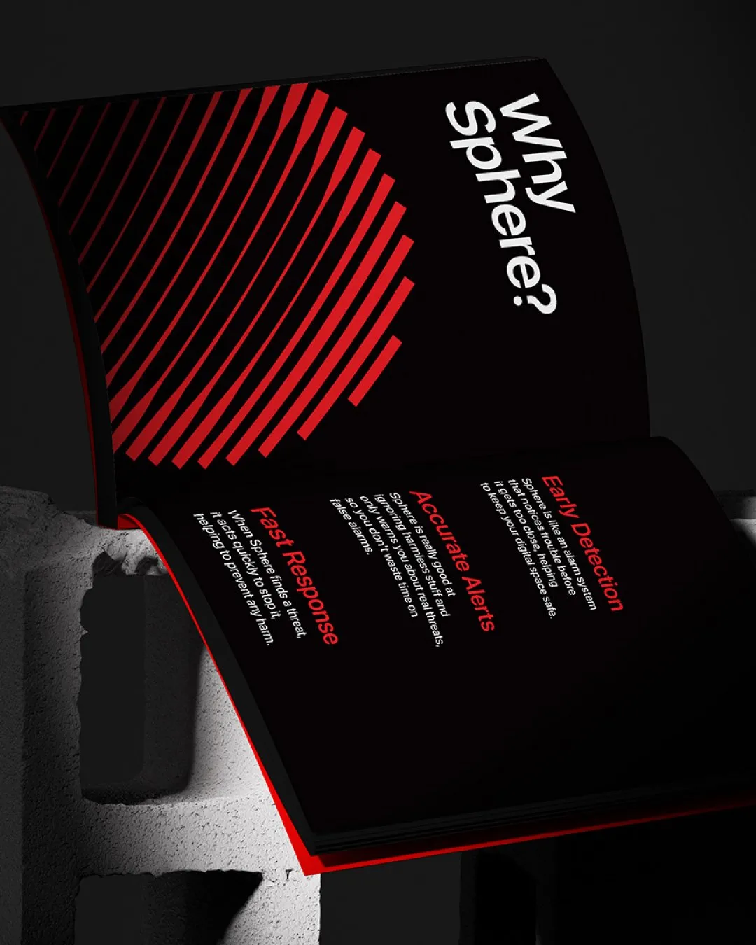
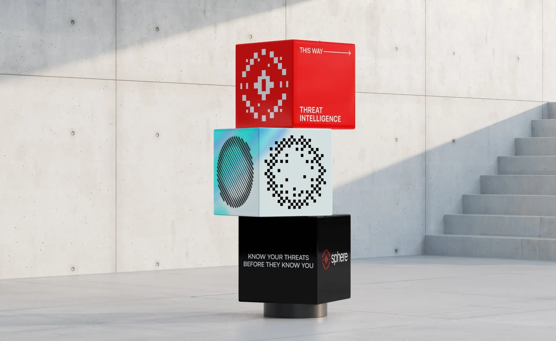
We built the identity around a sphere that could change form. Its different states were designed to express the stages of risk the system identified, giving the brand a visual language for changing information. The concept connected what Sphere did with how it appeared: a product that kept looking, learning, and revealing more needed an identity with that same sense of responsiveness.
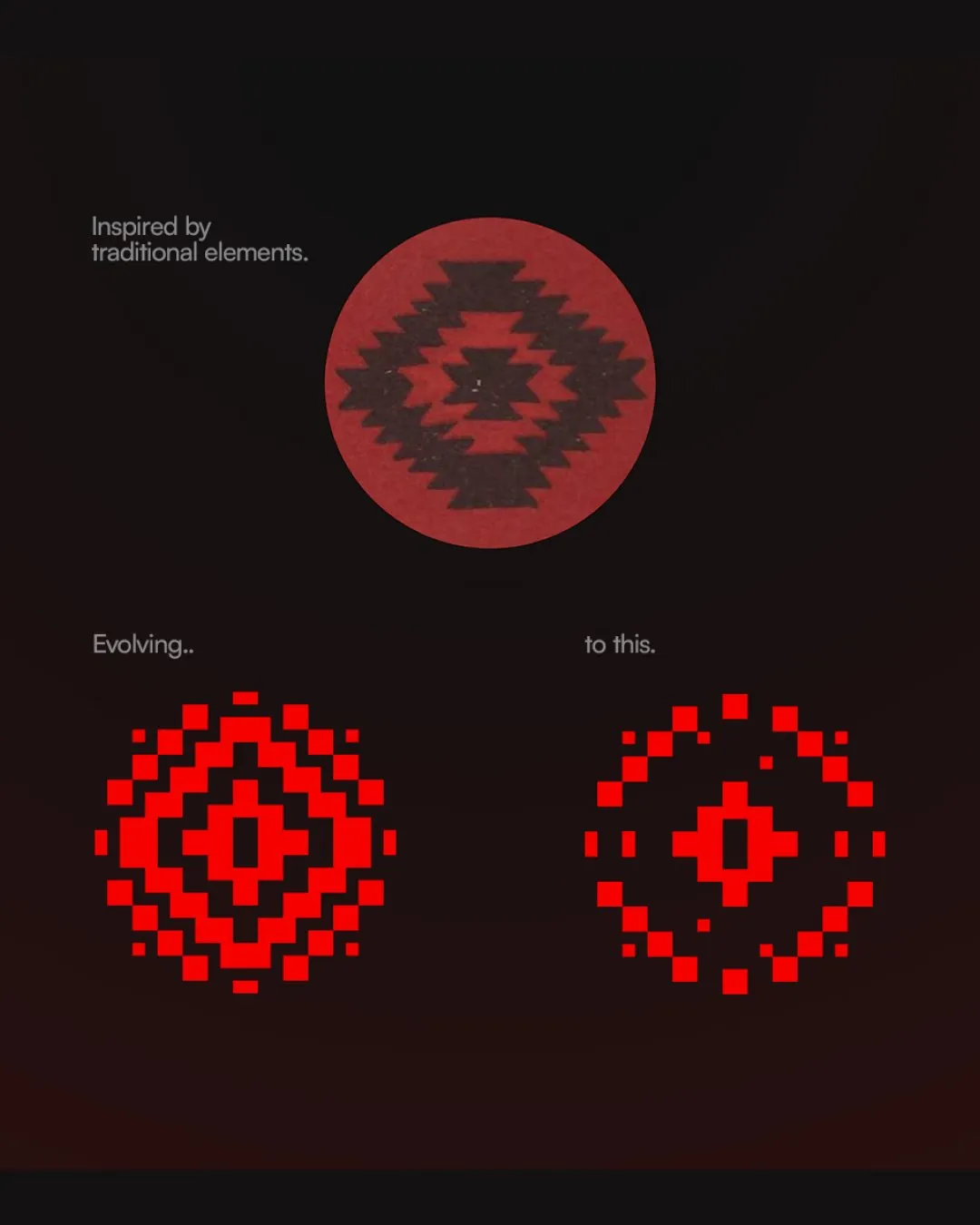
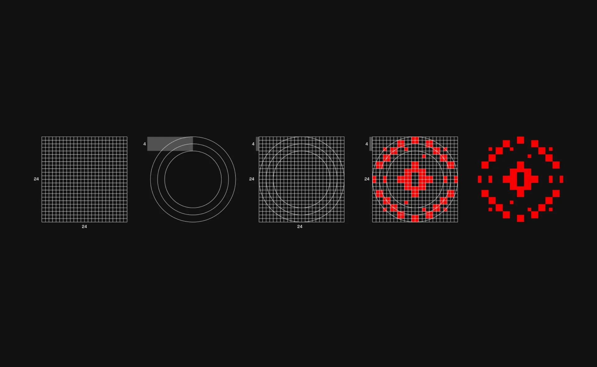
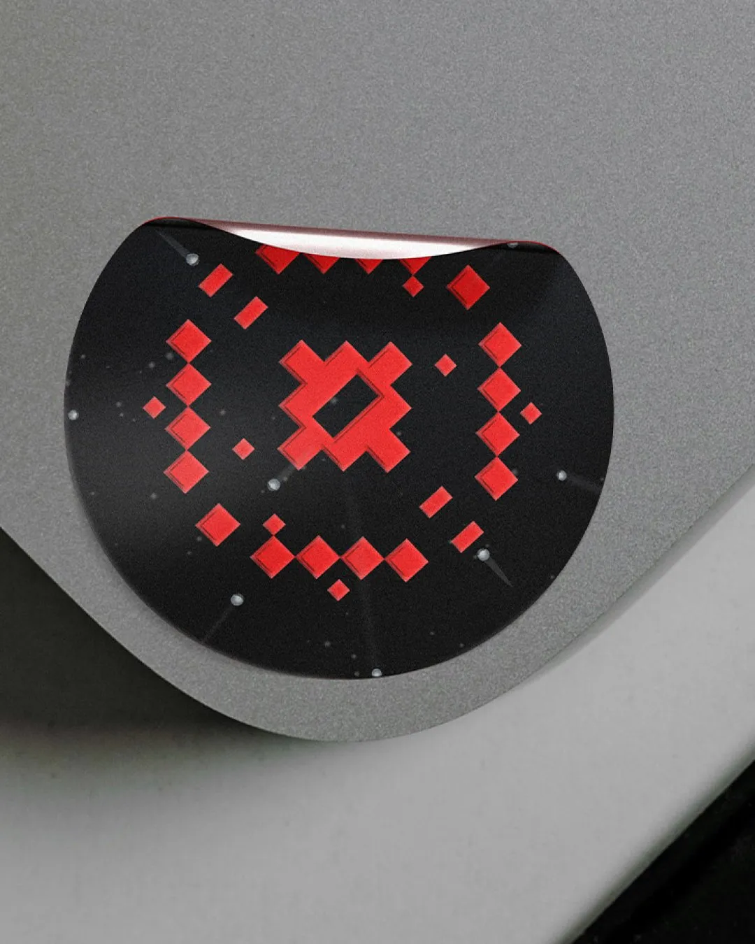
The core symbol combined a target with geometry drawn from traditional Albanian patterns. It connected the product’s purpose with a reference to its origins, brought together in a distinct, pixelated form. That geometry became part of the wider visual language, extending the idea beyond the primary mark.

System
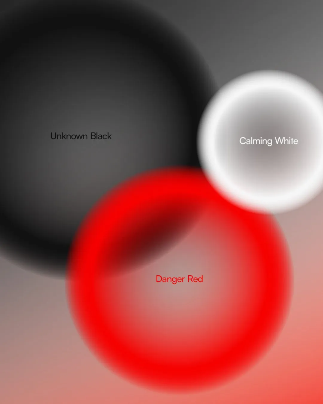
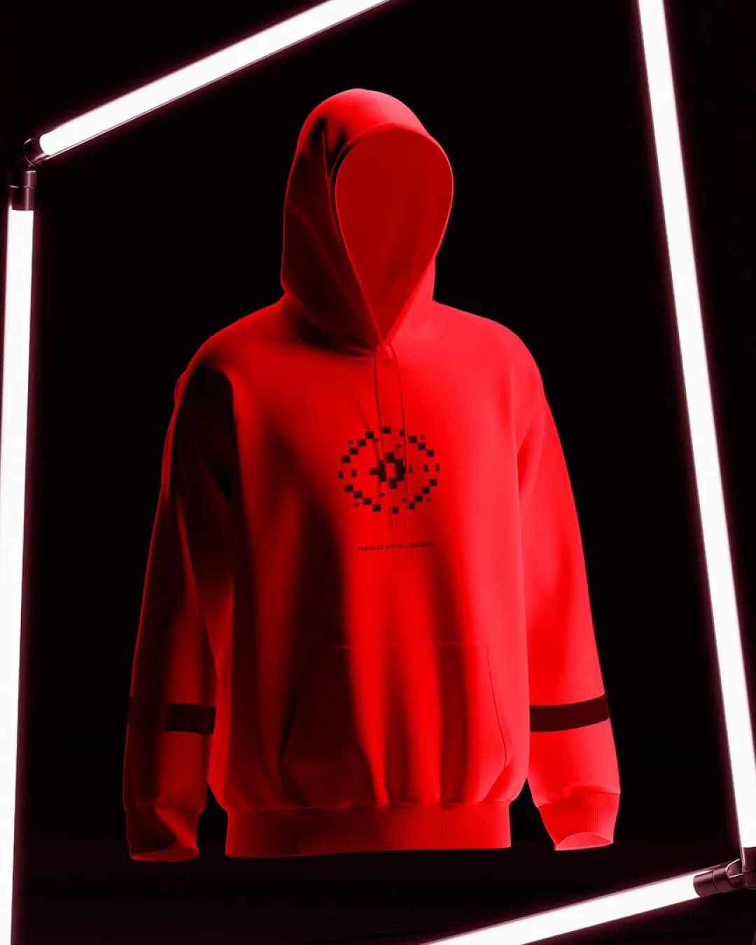
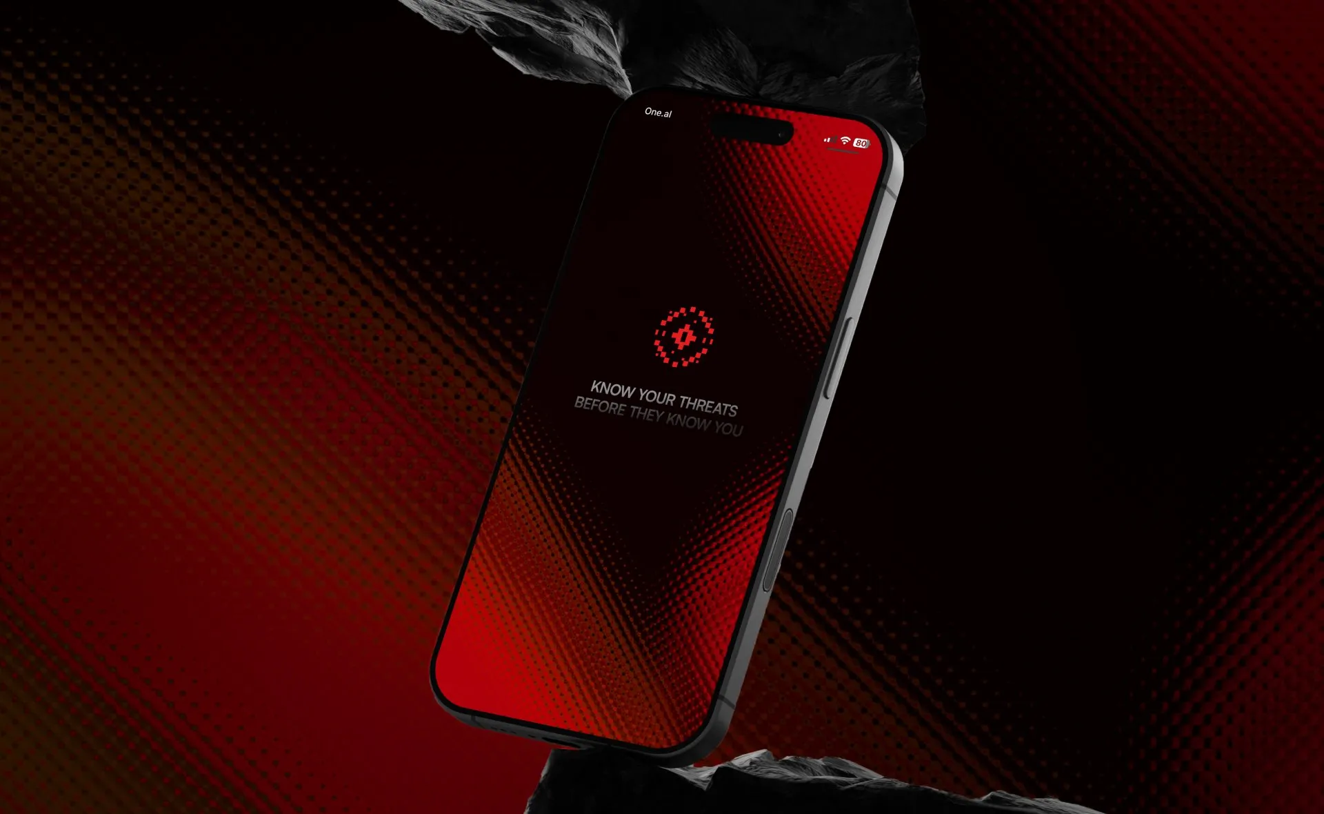
A focused palette of black, red, and white gave the system contrast, supported by customised typography. These consistent elements provided a structure around the changing forms. The identity could adapt while remaining recognisably Sphere, giving the team a connected set of elements to use across product and communication.
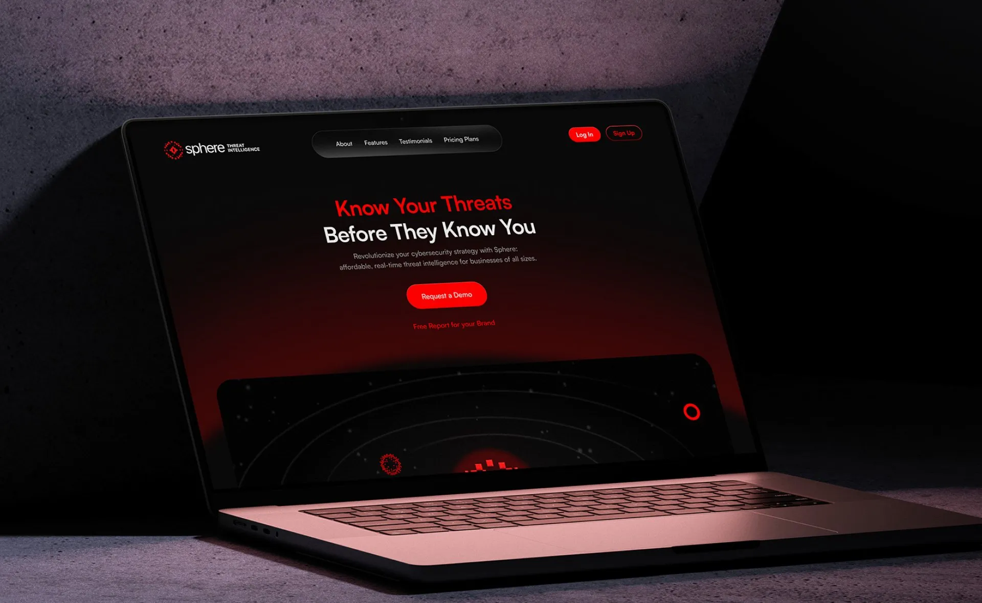
We extended that thinking into the landing page and SaaS interface design. The landing page introduced Sphere and its promise, while the interface brought the identity into the experience of using the product. Across both, the aim was to organise complex information clearly and connect the first impression of Sphere with the product people would encounter.
Change
The work gave Sphere a coherent foundation for launch: an identity, a landing page, and an interface connected by the same idea. Its flexibility gave the team room to develop the brand alongside the product, while a consistent visual language supported how they introduced it. Sphere could enter those early conversations with a presence shaped around the intelligence it was building.
Read similar case studies

Vetch Studio
A studio rooted in the work it serves.

Axiom Breach
Building a credible presence for a new cybersecurity product.

Helios
A clear identity for a simpler approach to solar.