Helios
A clear identity for a simpler approach to solar.
- Industry
- Solar energy
- Growth stage
- Growth stage
Challenge
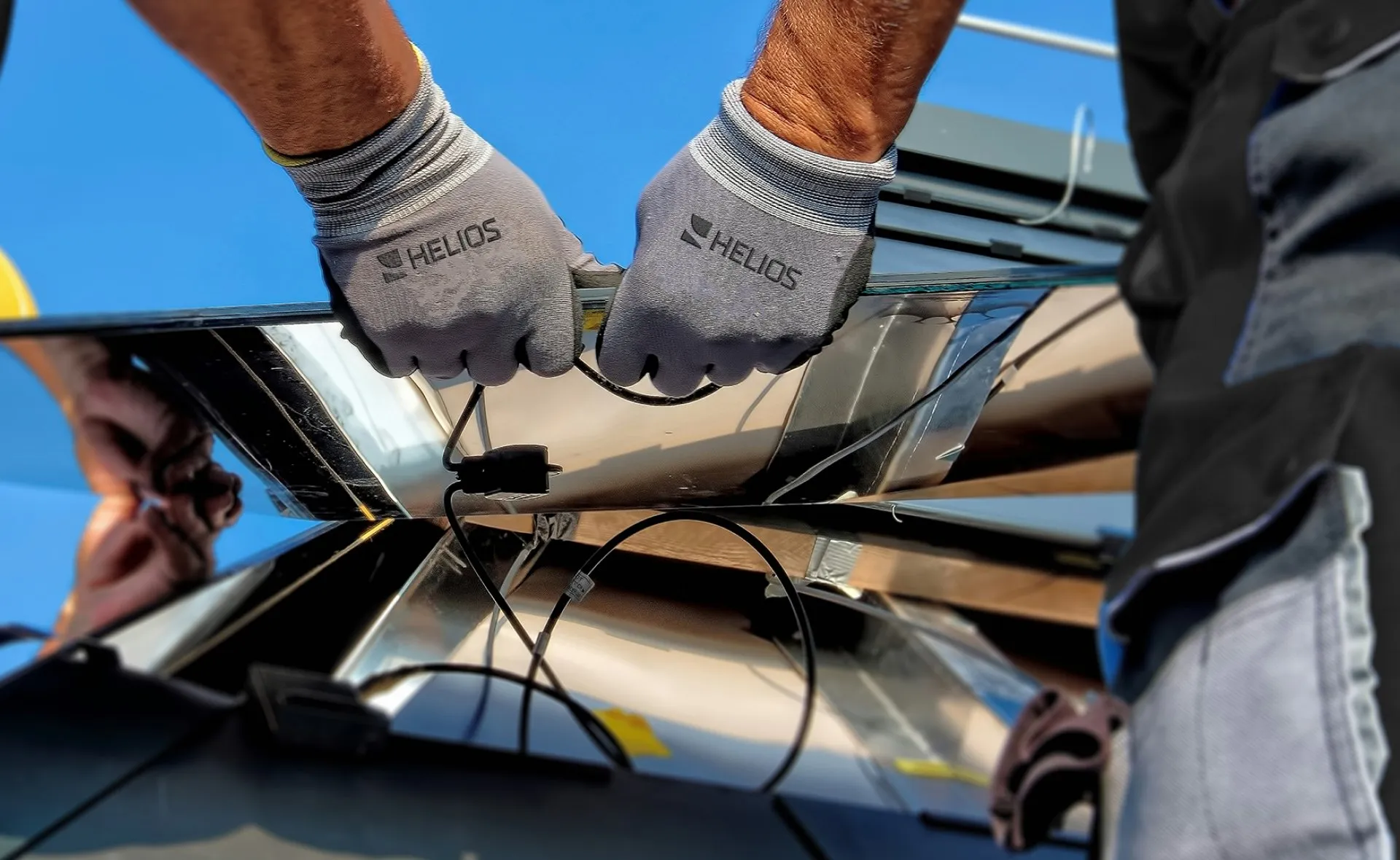
Helios began with a practical observation. After years in the solar industry, its founder saw how mounting systems added unnecessary complexity, cost, and waste to photovoltaic installations. He developed structures designed to be simpler, more affordable, and fully reusable.
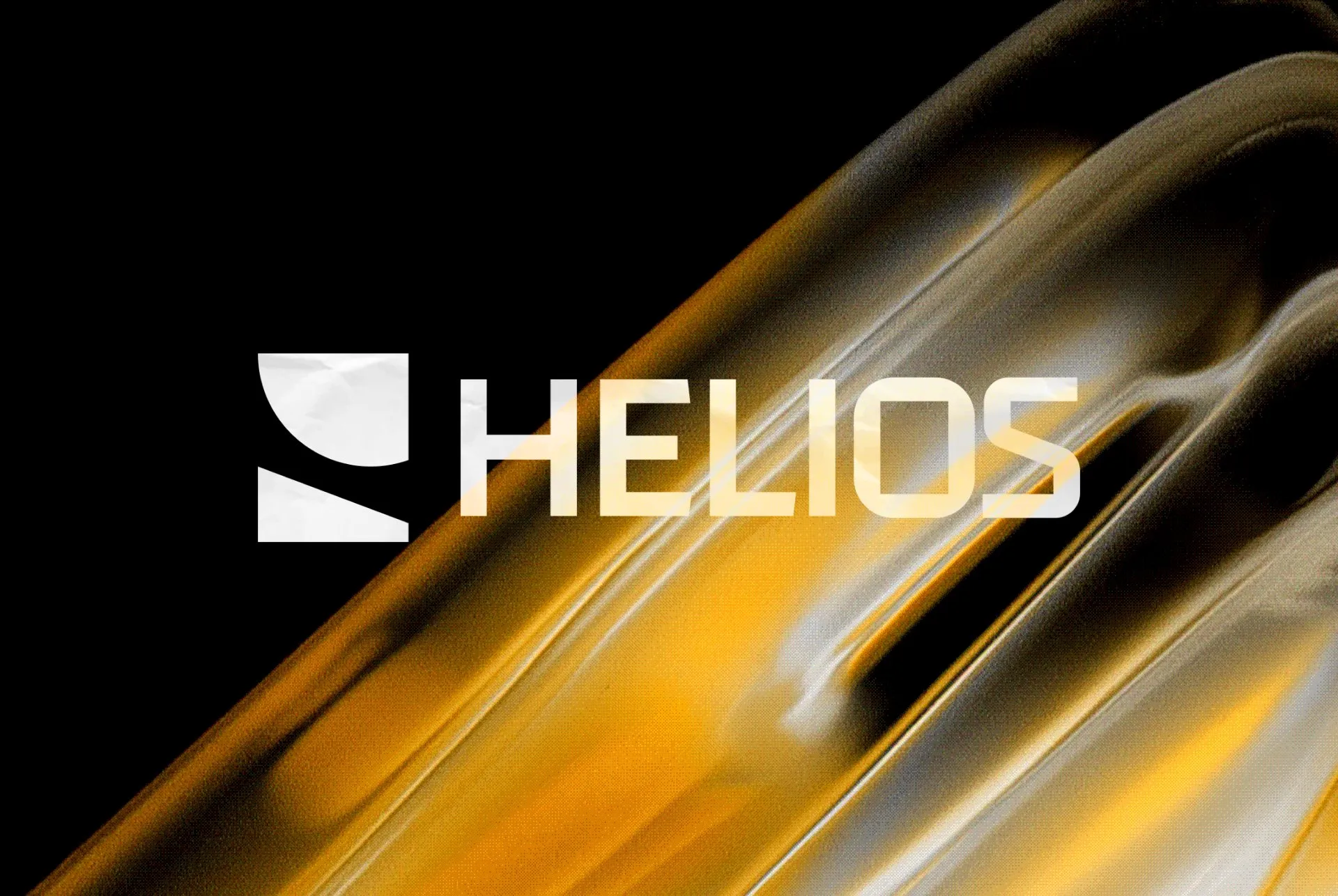
The team came to us to give that approach a recognisable identity. In a market of similar-looking solutions, the brand needed to make the thinking behind Helios visible and give the company a credible starting point.
Identity
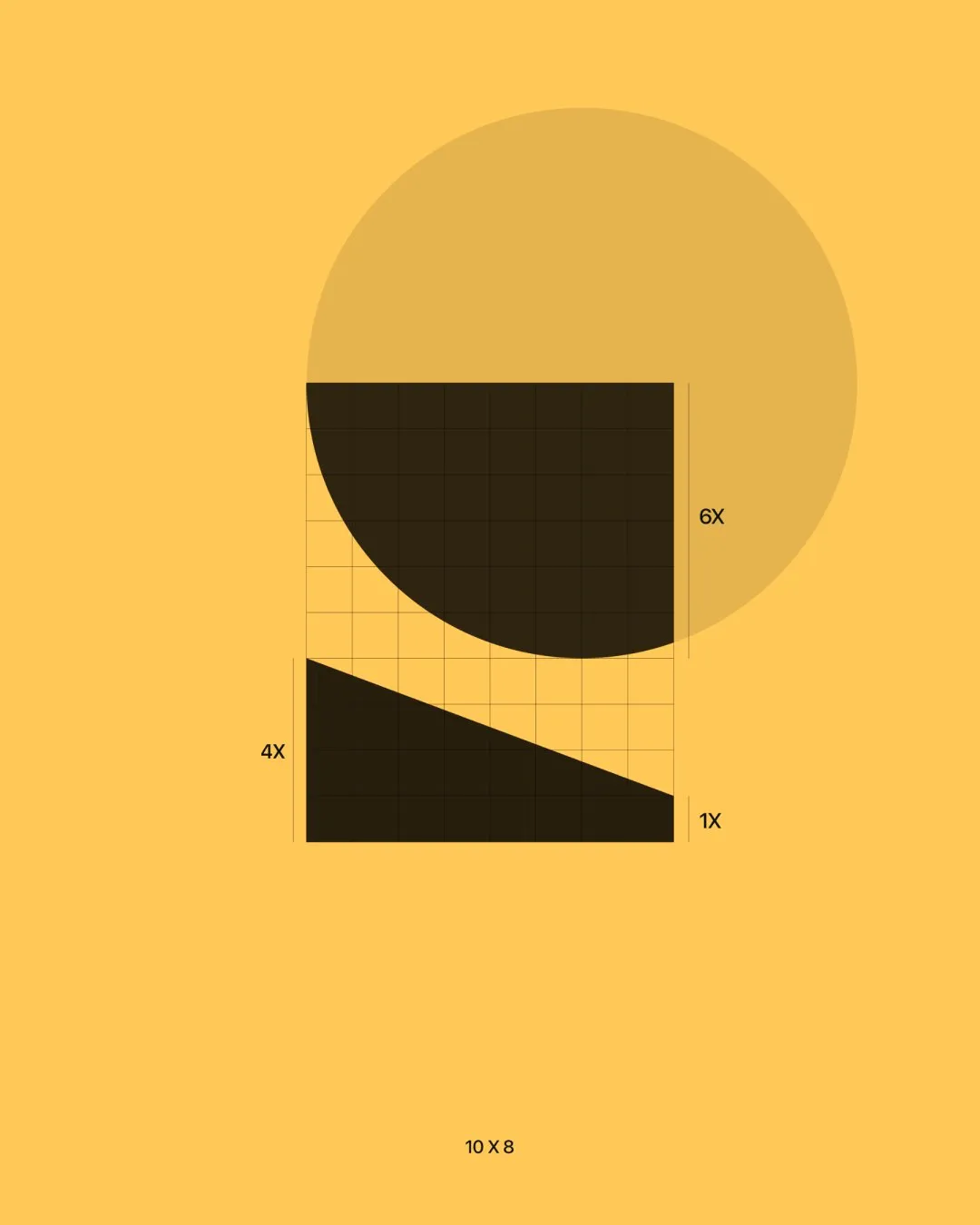
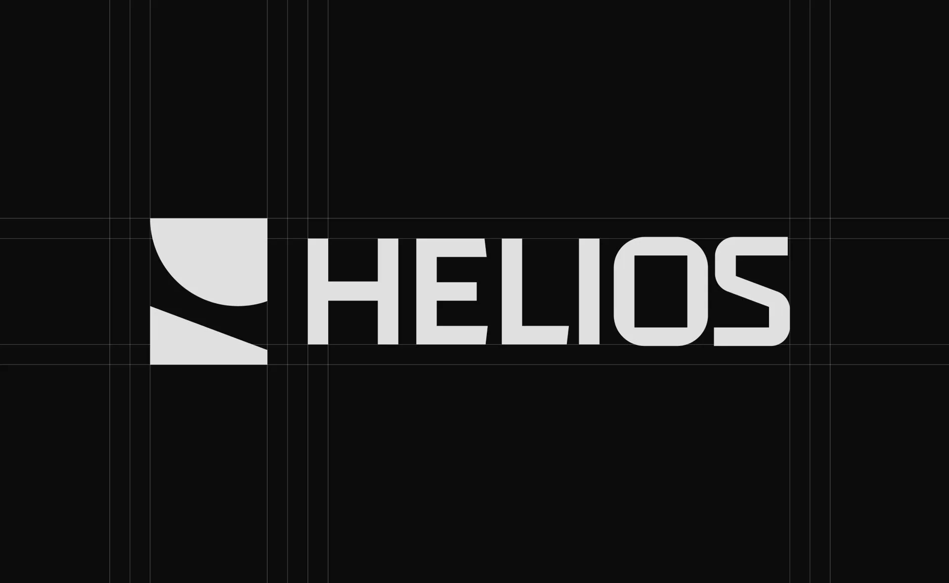
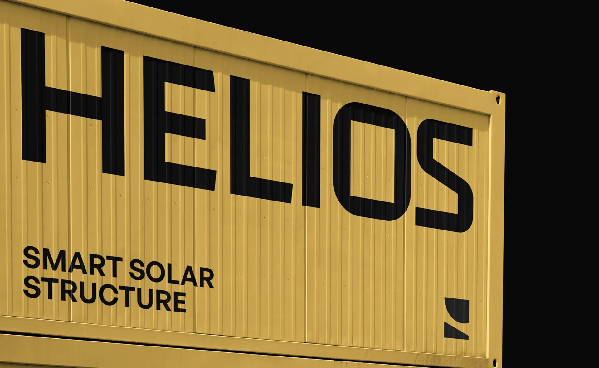
We took our direction from the relationship between solar energy and the structure supporting it. The symbol brought together the circle of the sun and the slope of a photovoltaic panel, connecting the source of energy with the product Helios builds.
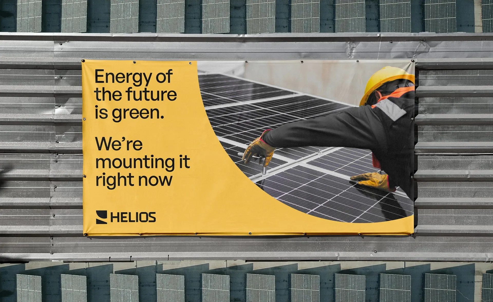
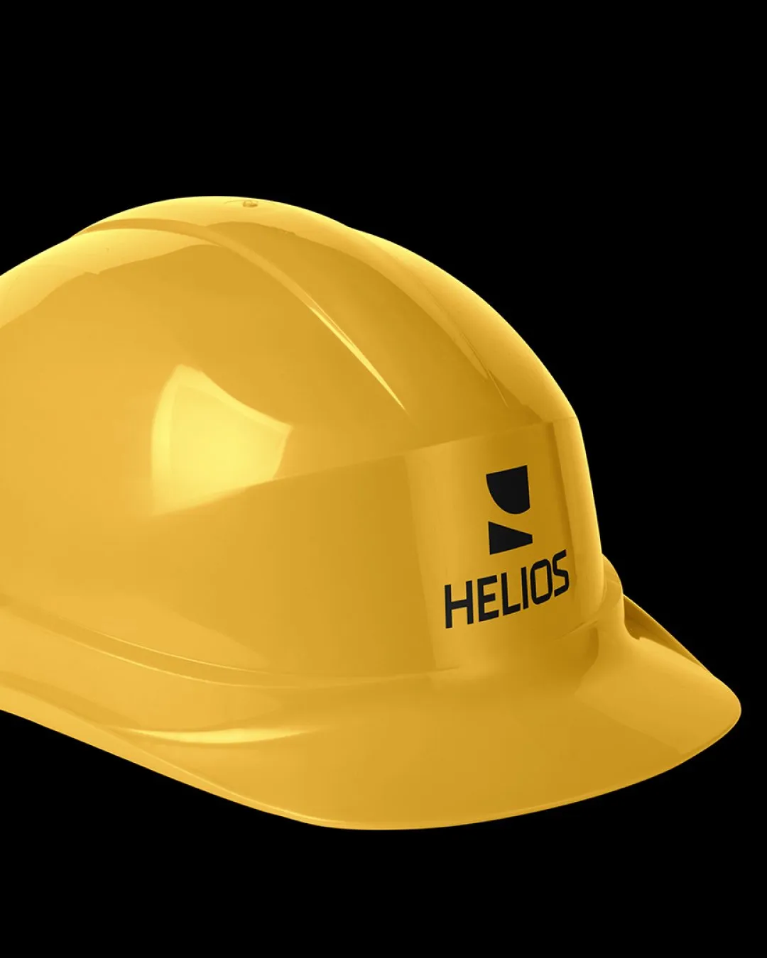
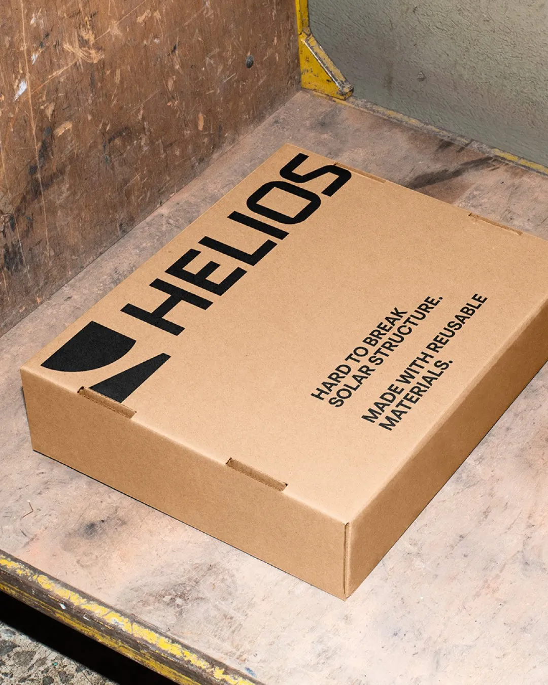
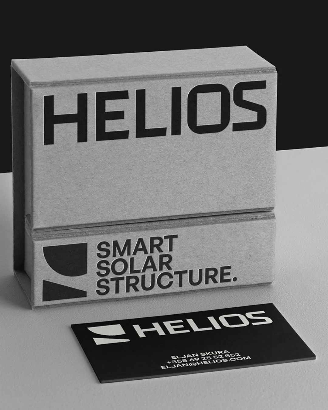
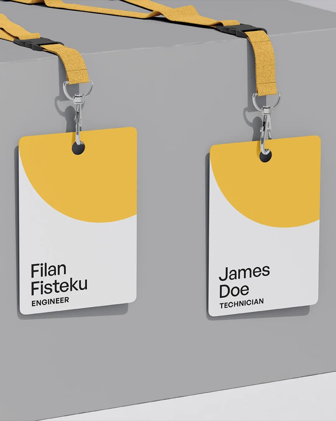
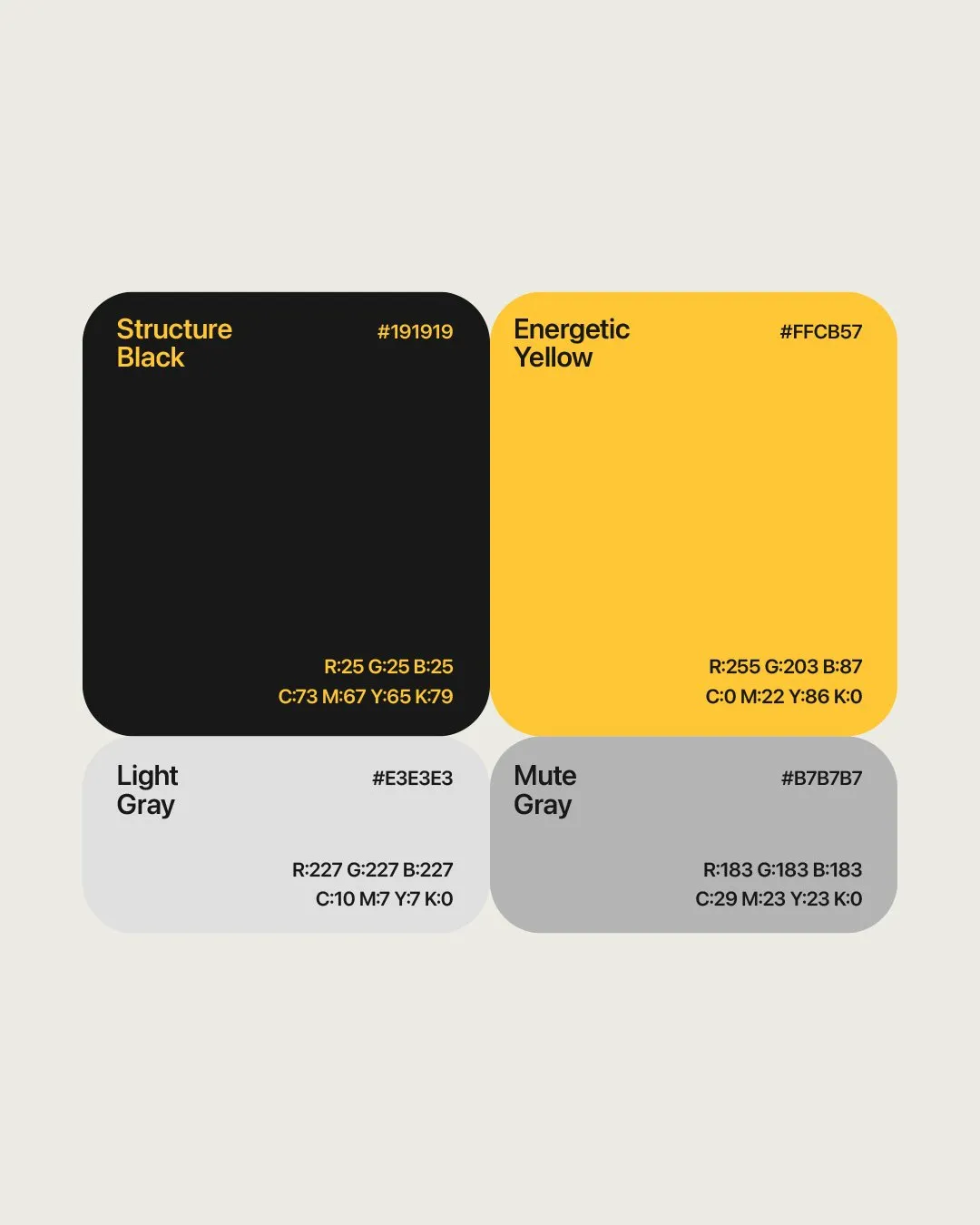
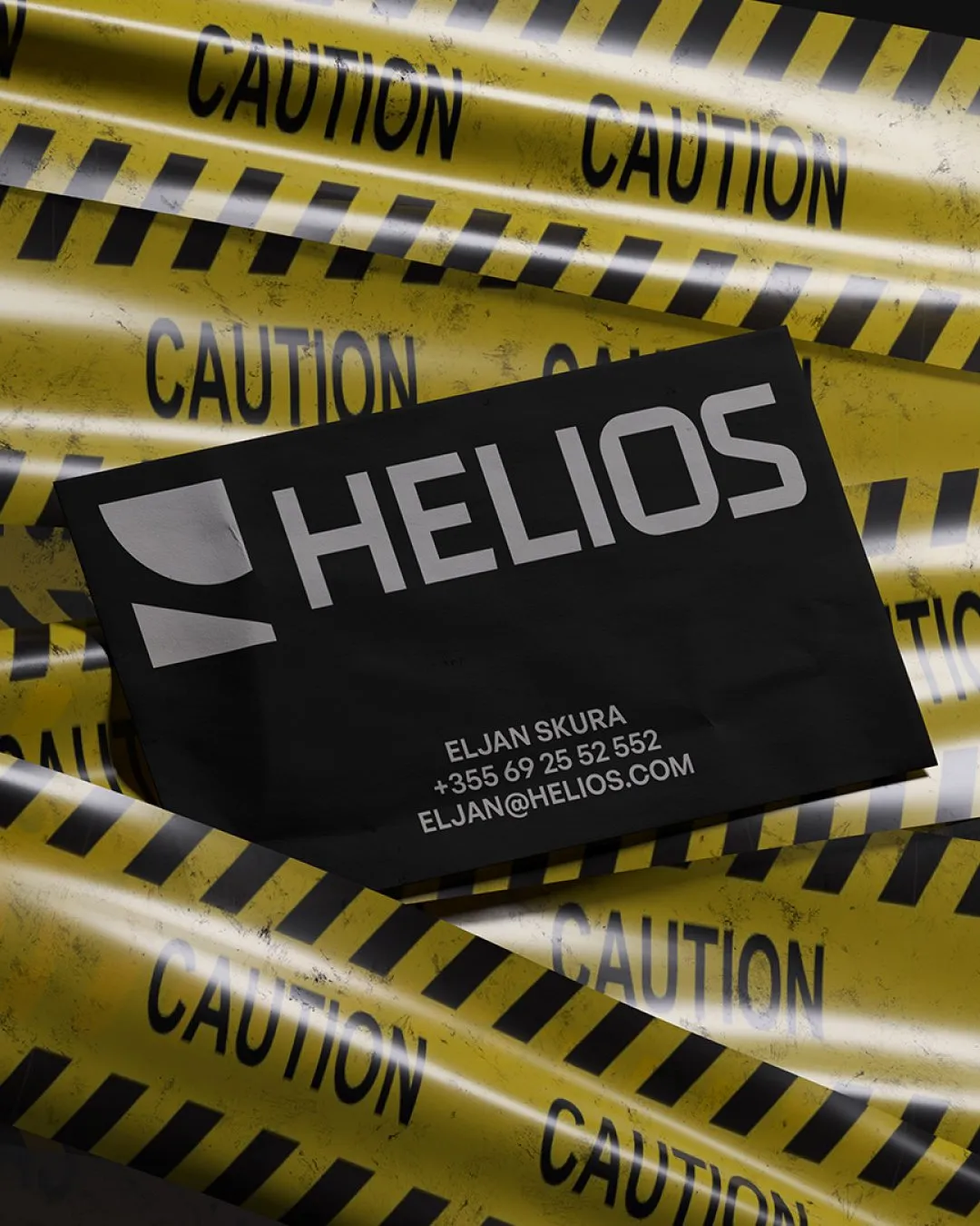
That geometry carried into the customised typography, linking the letterforms to the mark. Yellow brought energy to a palette grounded in black and supported by greys. Together, these elements formed a consistent visual language for use across packaging, equipment, and company materials.
The identity followed the same principle as the product: a considered structure, with each part serving a purpose.
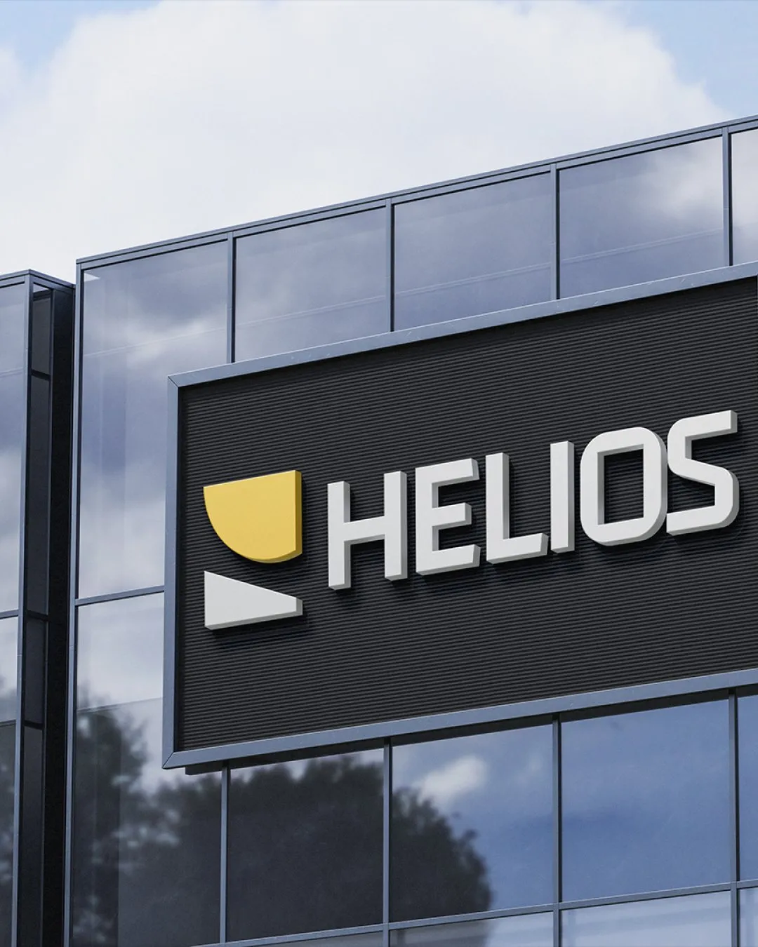
Outcome
Helios gained an identity connected to the substance of its offering. The symbol, typography, and wider system gave the team a coherent way to introduce the company and present its products as the business developed.
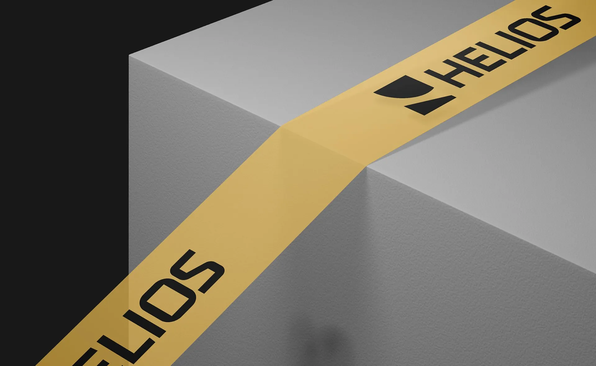
Our collaboration influenced the following results

Elian Skura
Product Manager @Helios
“STUDIOZ captured our vision beautifully, blending creativity with a deep understanding of our brand identity. The final design is not only visually striking but also resonates perfectly with our values.”

Read similar case studies
Sphere
An identity built to move with threat intelligence.
Witway
A friendly identity for a new way to meet online.

Axiom Breach
Building a credible presence for a new cybersecurity product.