Witway
A friendly identity for a new way to meet online.
- Industry
- Collaboration software
- Growth stage
- Pre-launch
Challenge
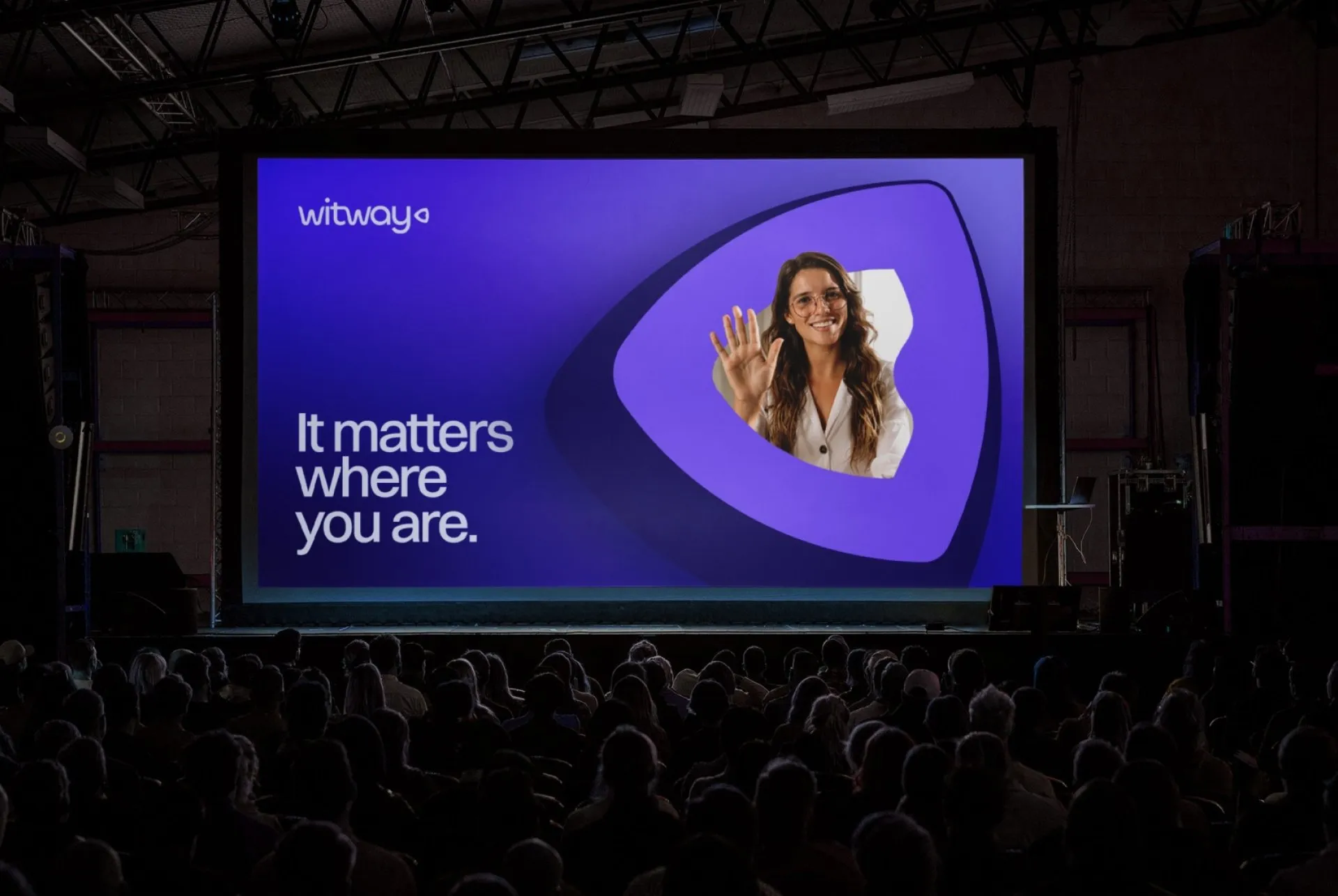
Witway was developing an add-in for Microsoft Teams and Zoom, with the ambition to make online meetings more engaging and secure. The product was still at MVP stage, and the team needed a visual identity as it prepared for launch.
The challenge was to bring those ambitions together. The brand needed to feel approachable and playful while communicating the confidence associated with security.
Identity
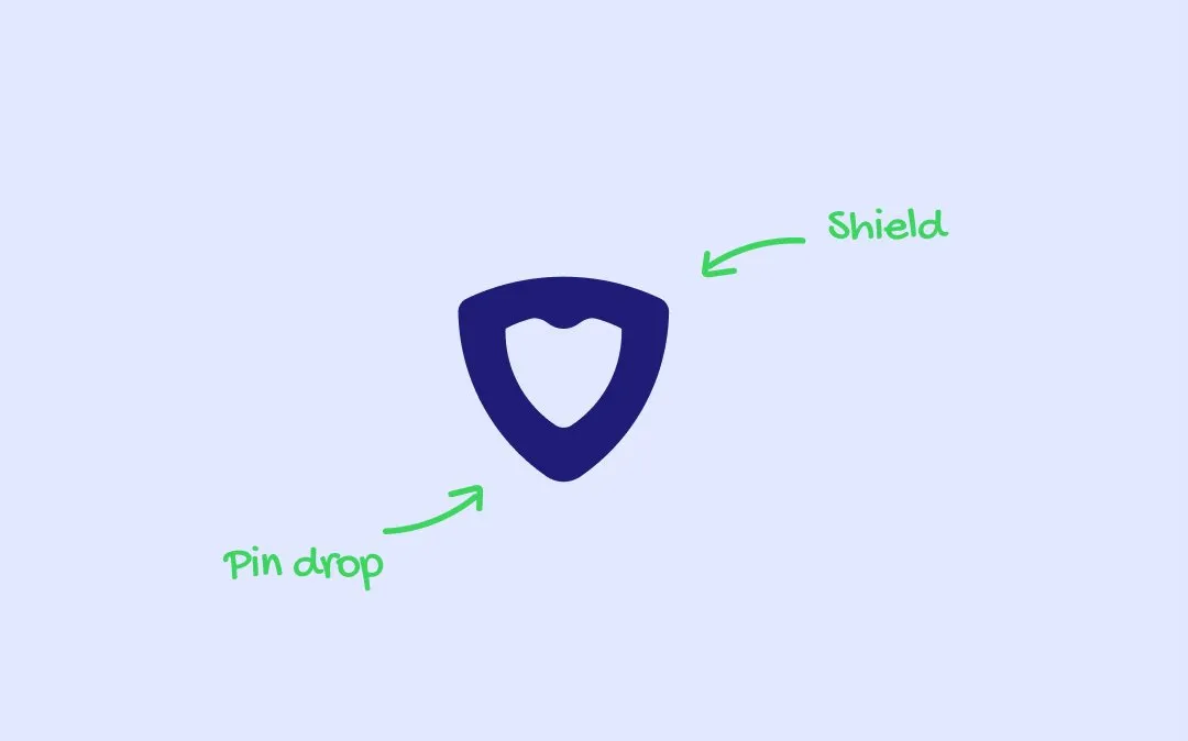
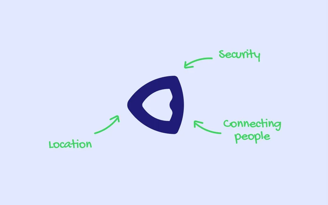
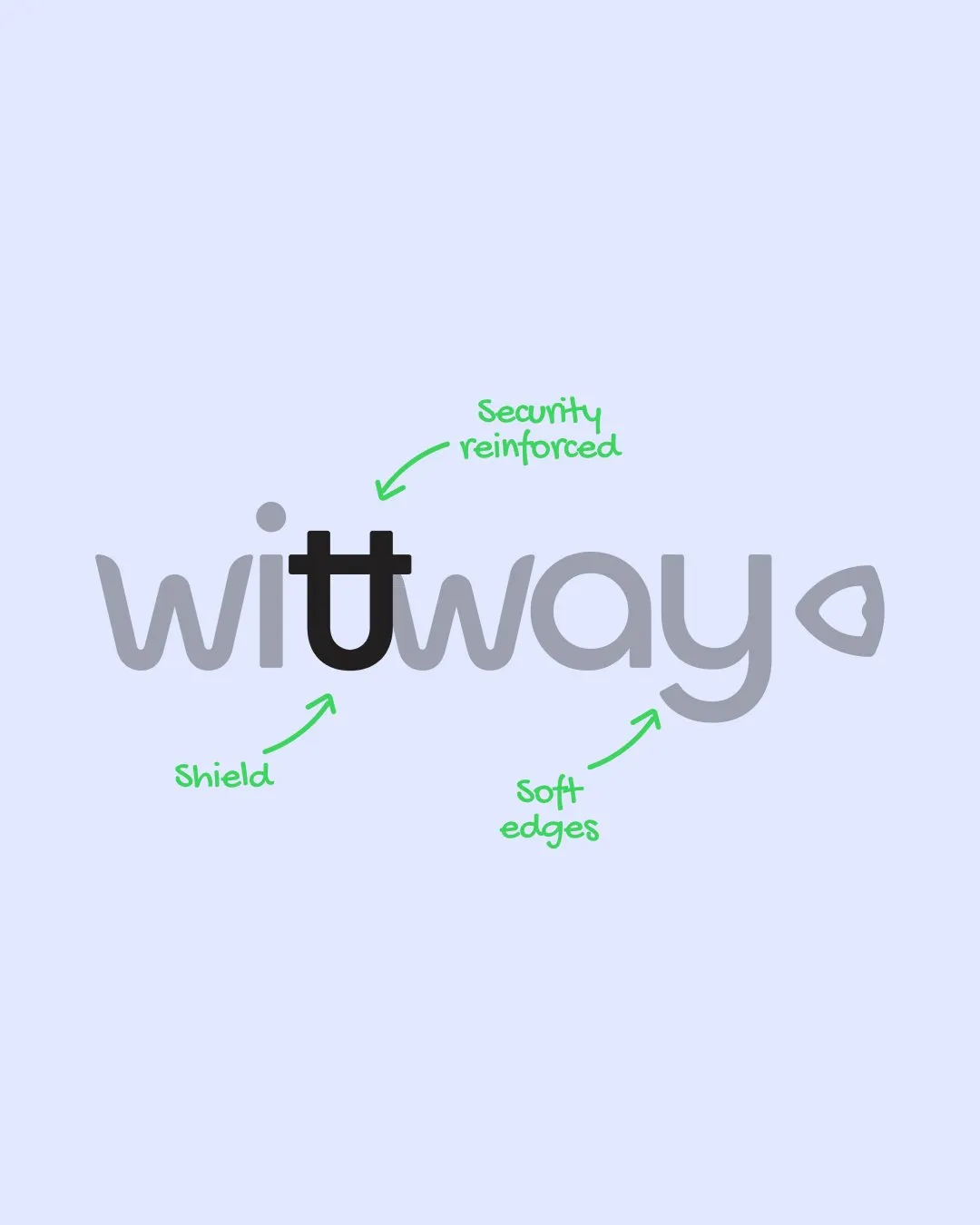
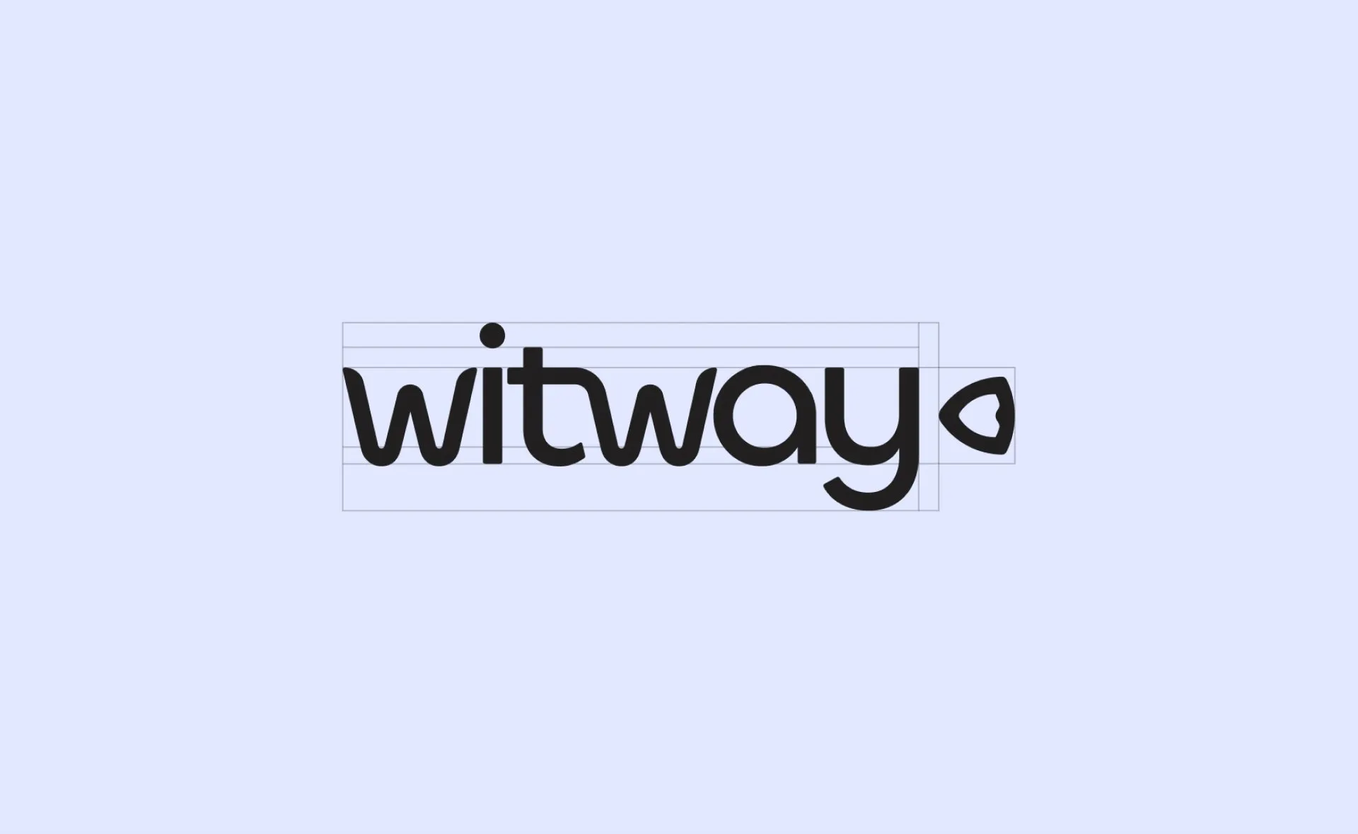
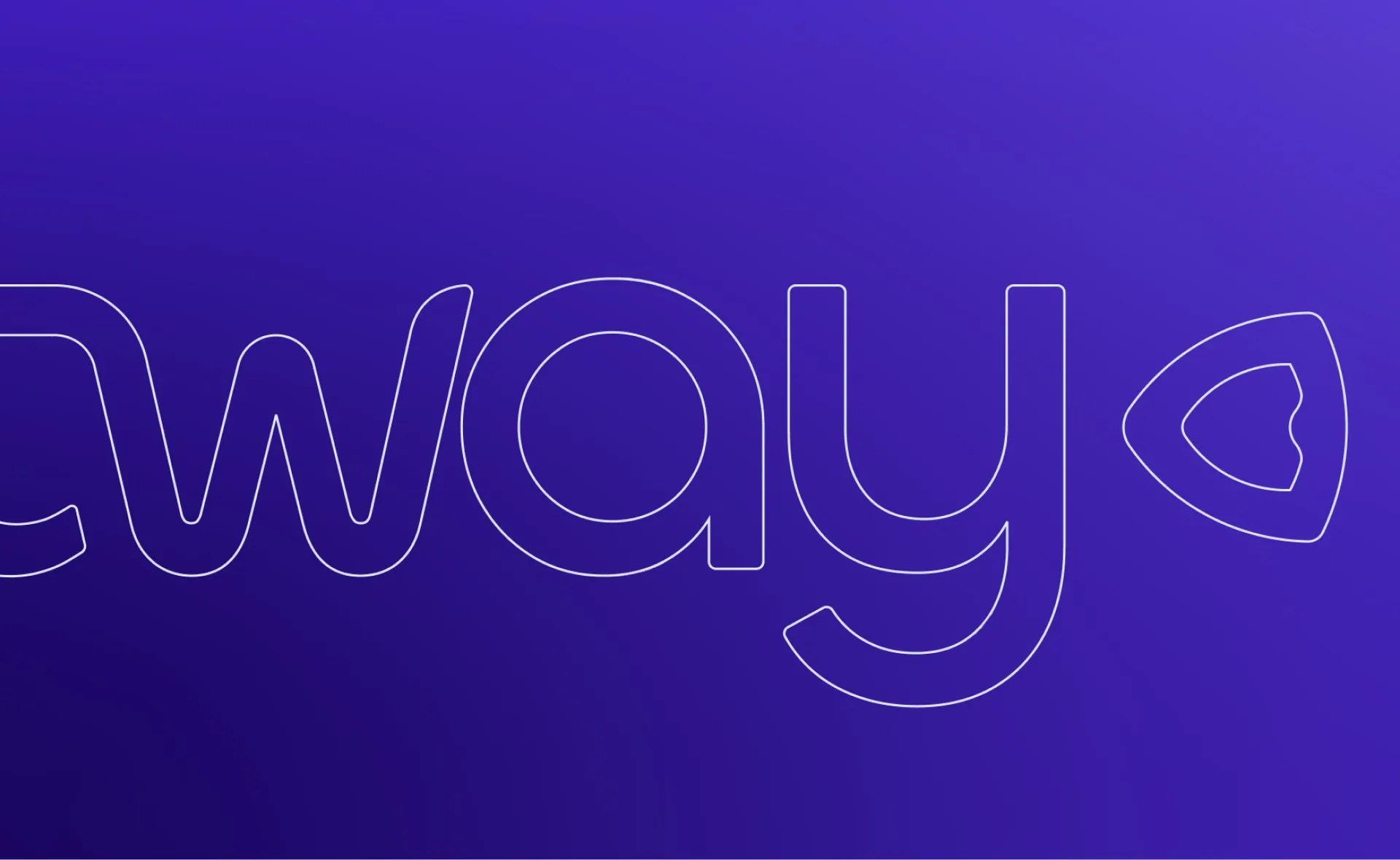
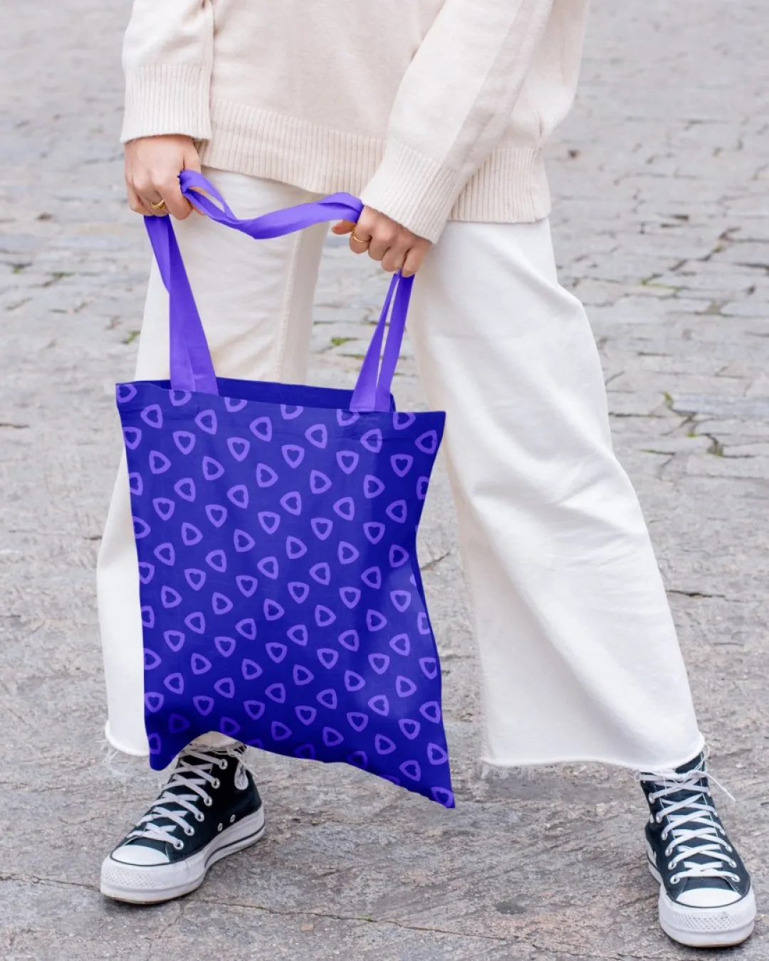
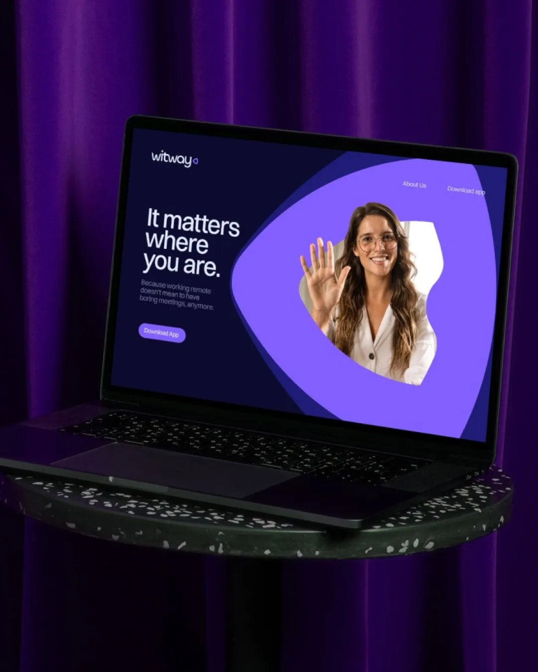
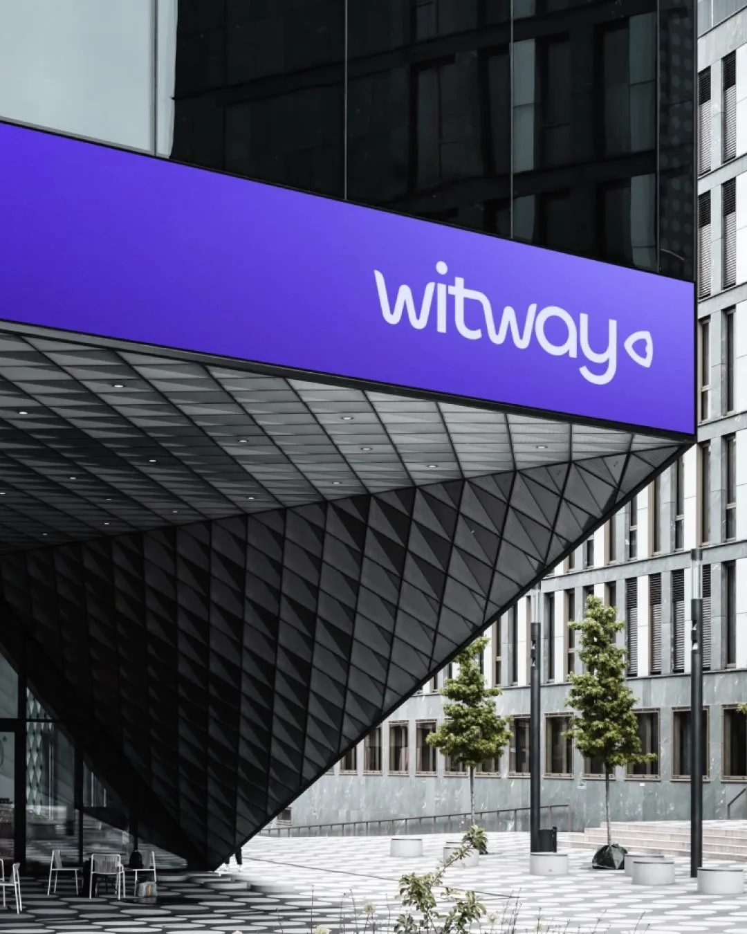
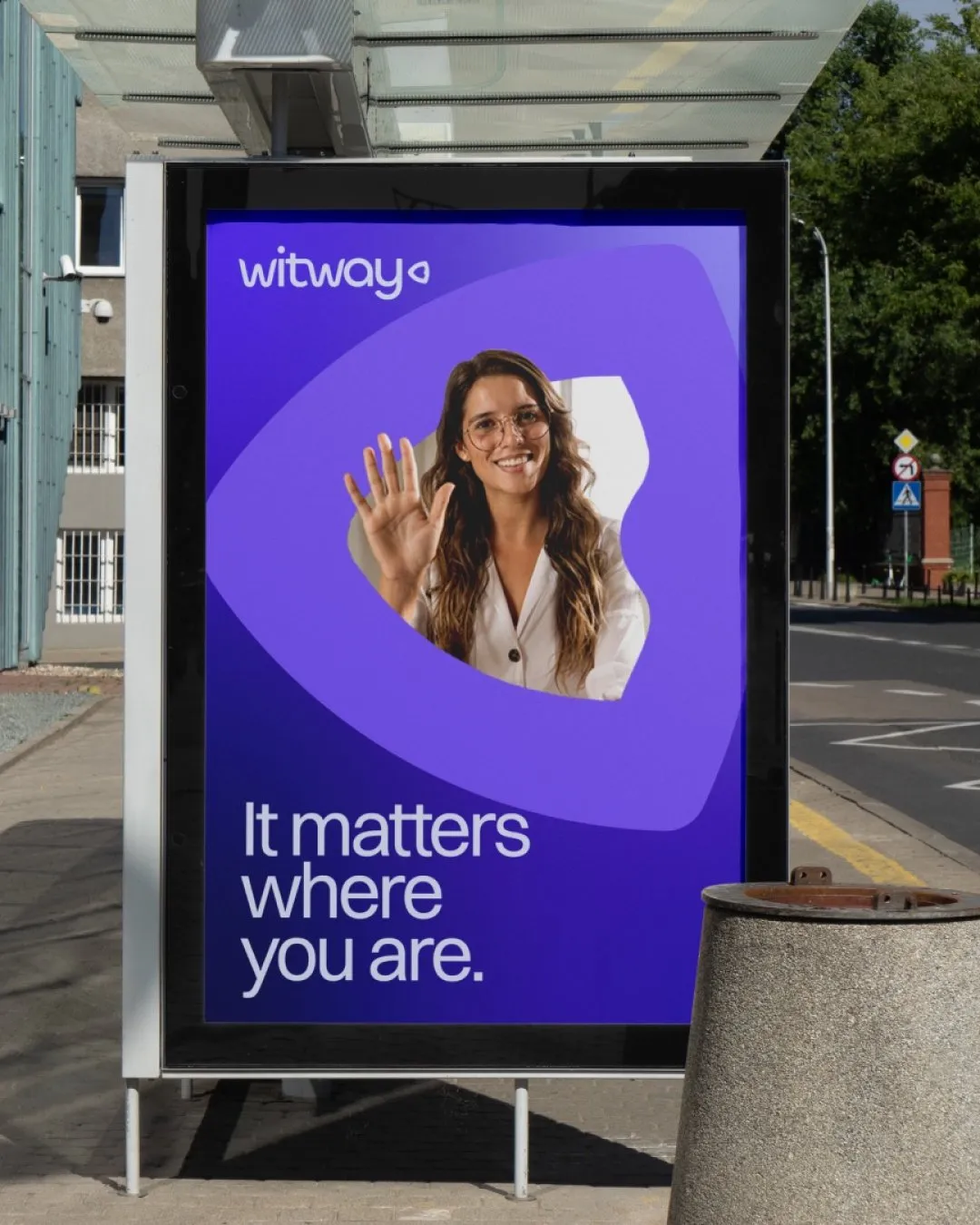
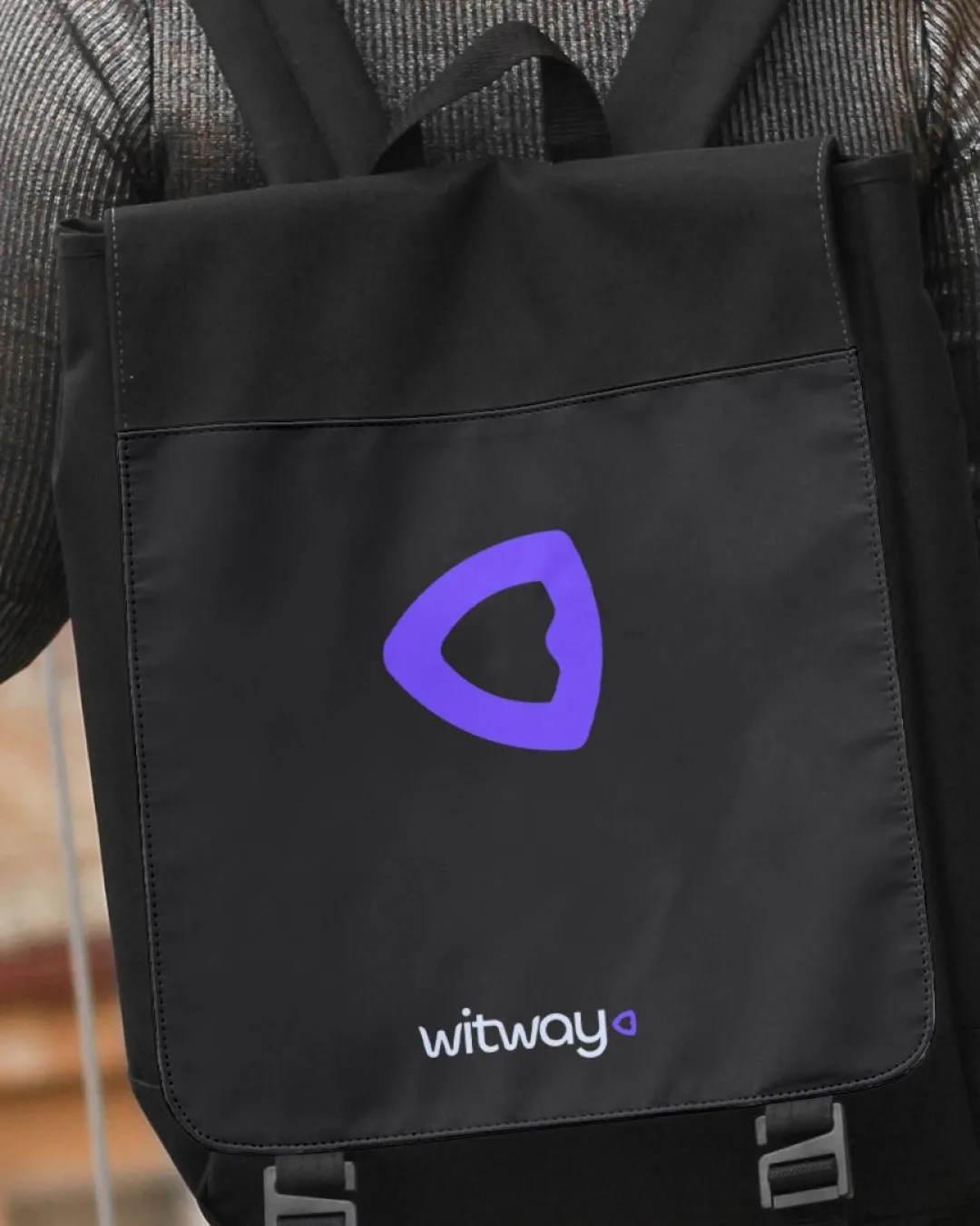
We built the symbol around three ideas central to the product’s direction: security, location, and connection. A shield and location pin came together in a compact form, with the geometry also suggesting people connecting.
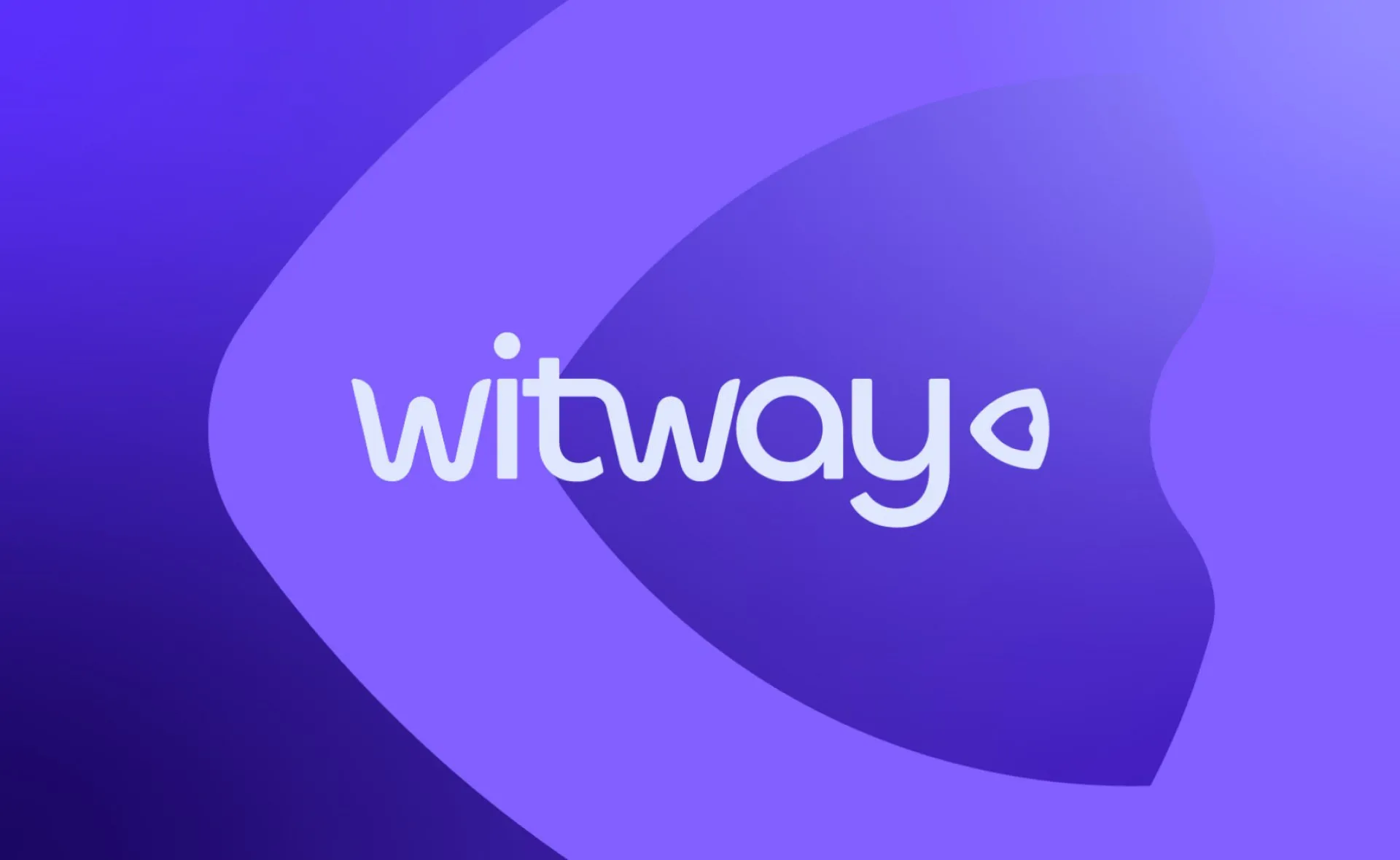
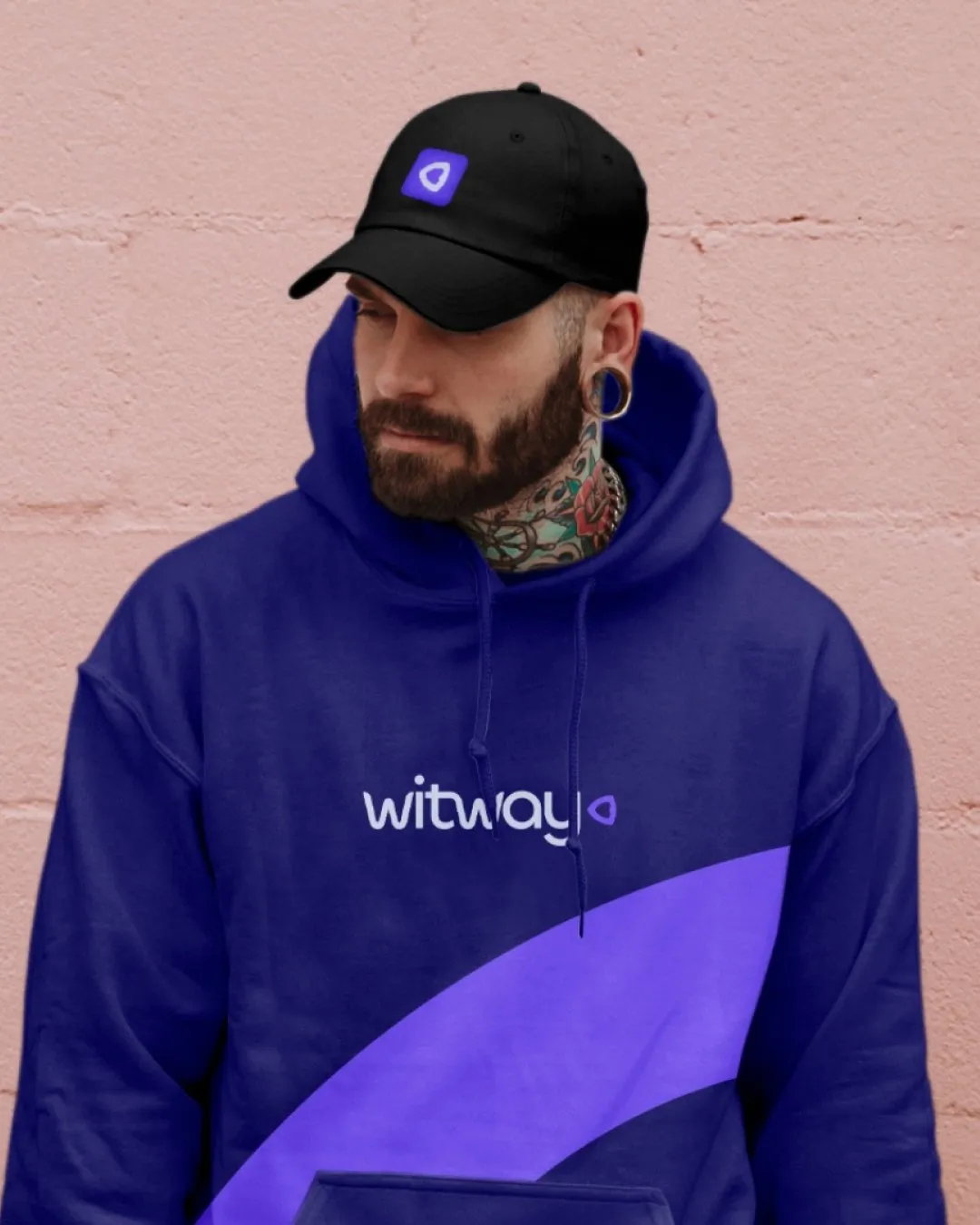
That thinking carried into the wordmark. Custom lettering created a connection between the T and W, using the negative space to echo the shield. Soft edges gave the typography a more welcoming character, reinforcing the balance between protection and approachability.
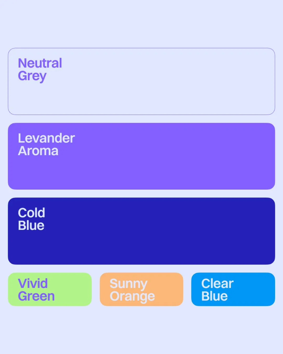
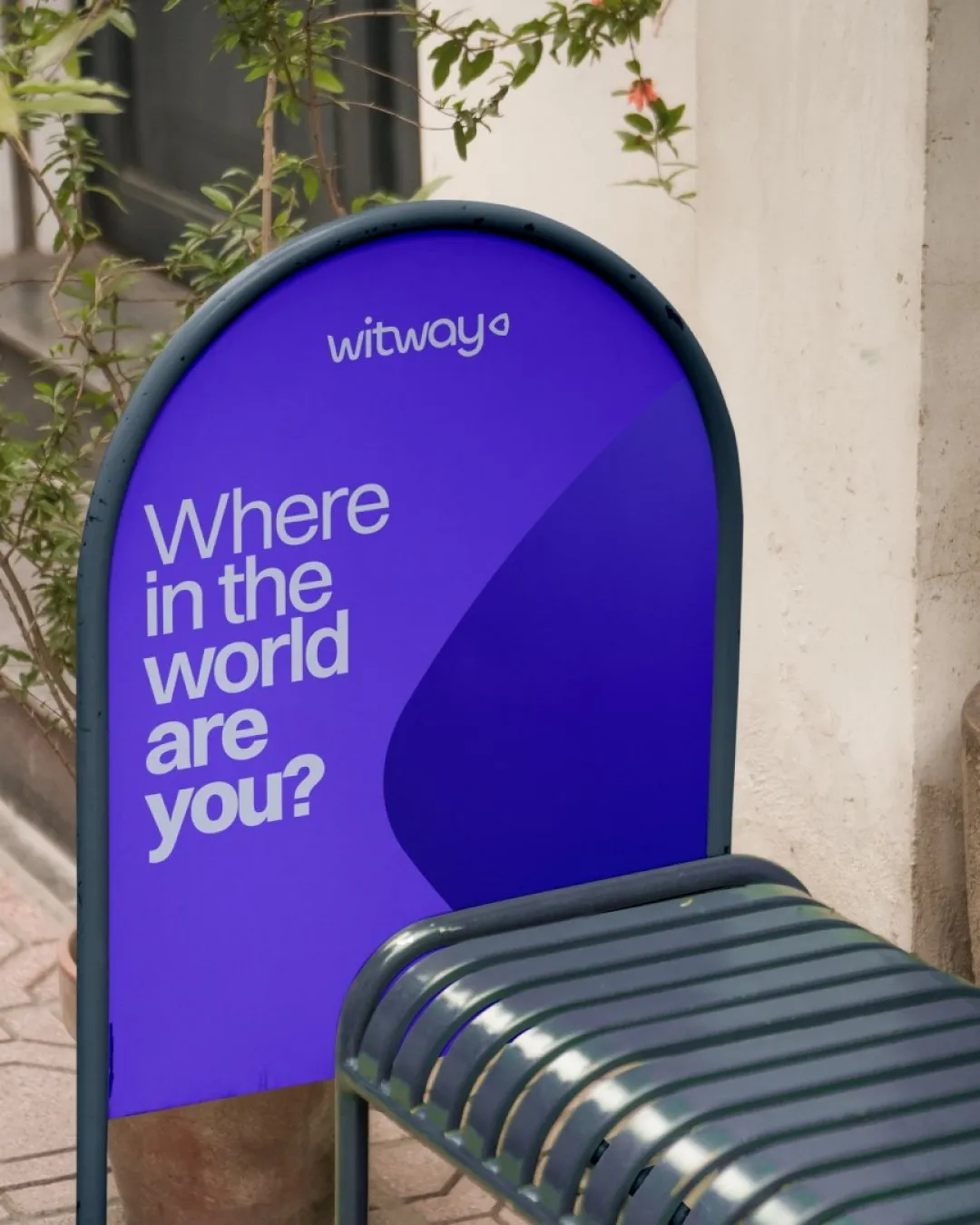
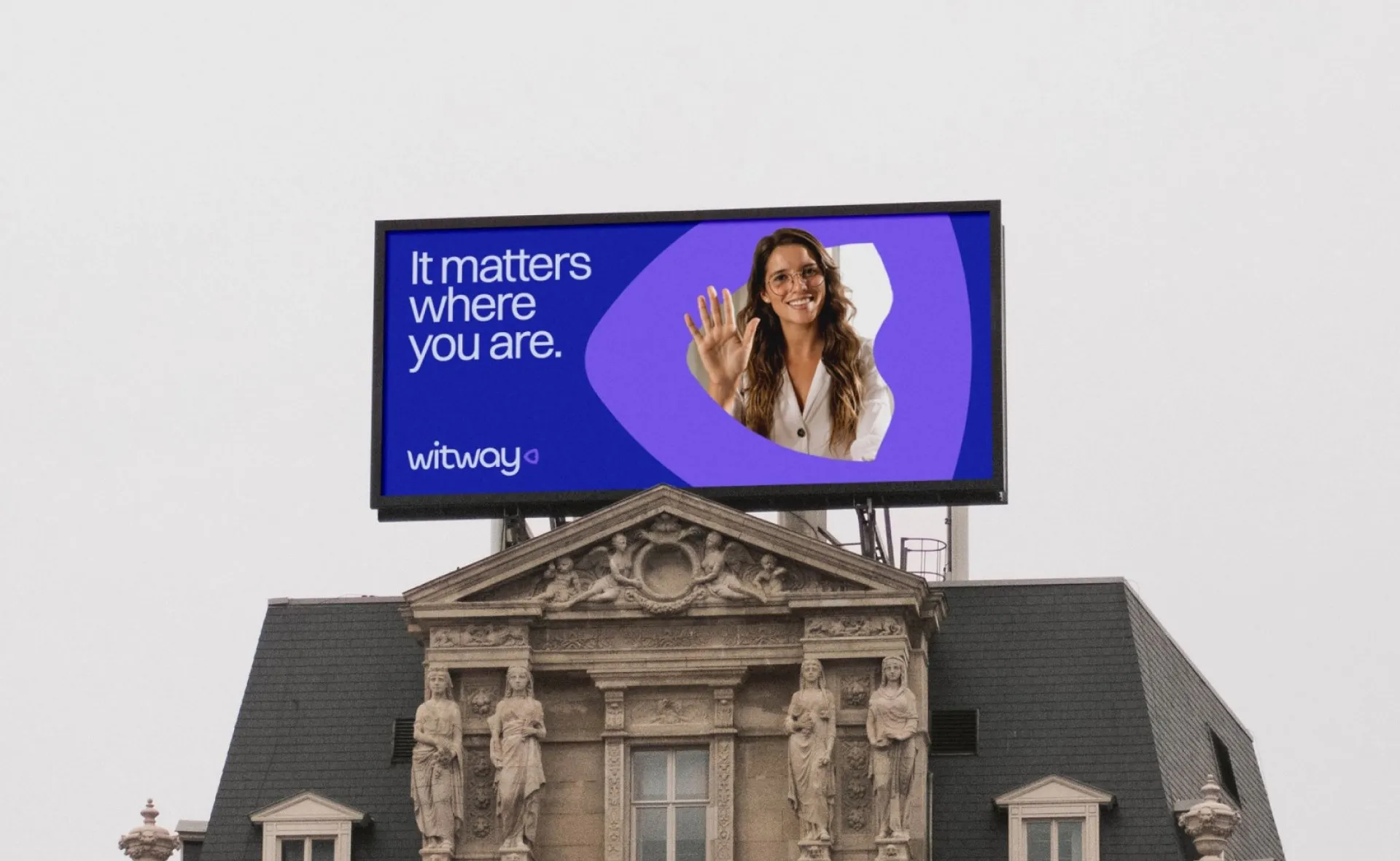
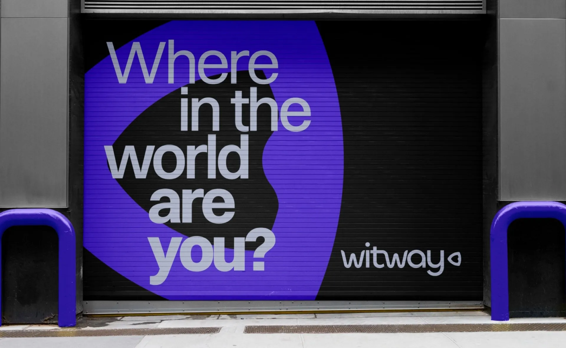
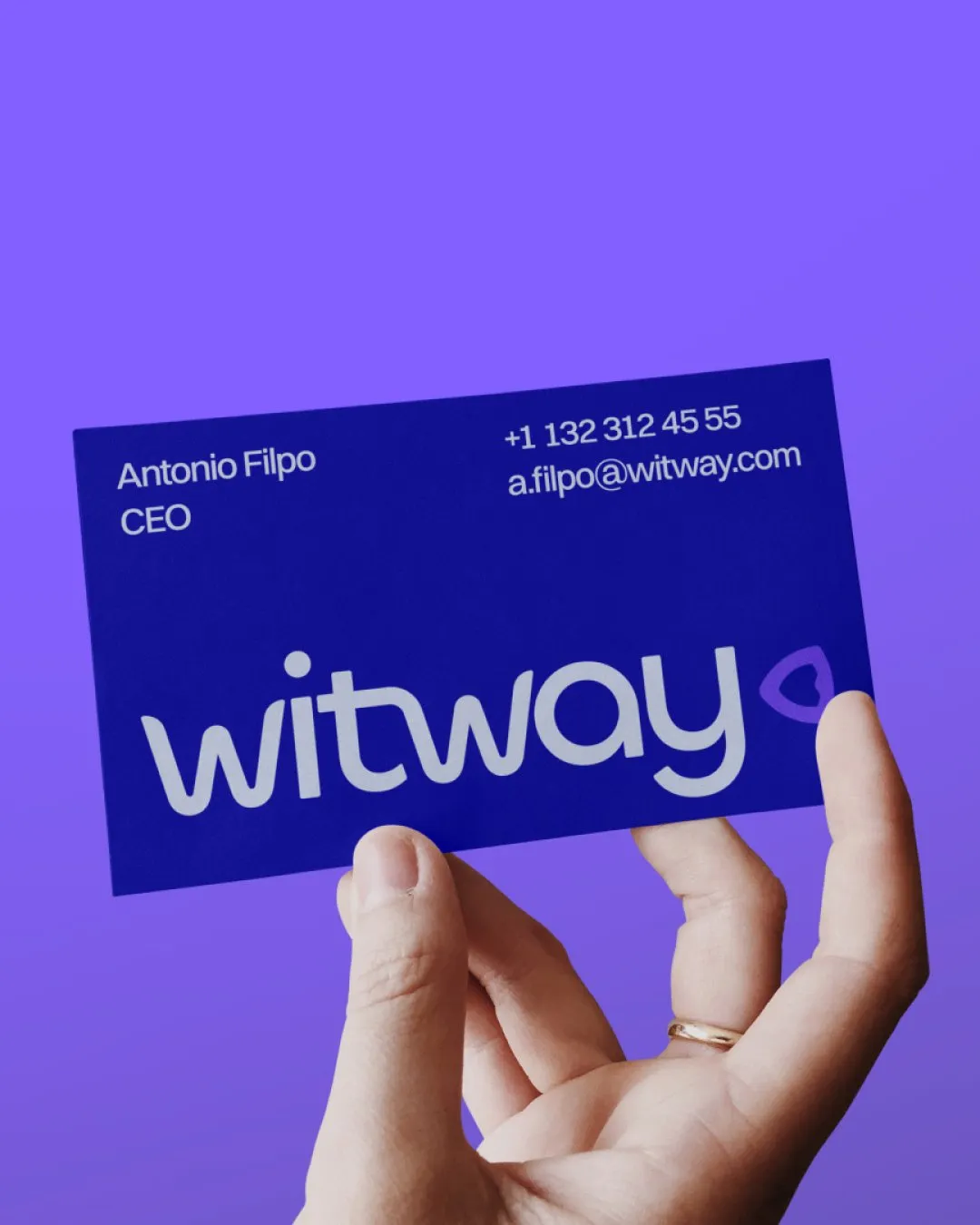
A playful colour palette extended that character across the identity, giving Witway a recognisable presence alongside the meeting platforms it was being developed for.
Outcome
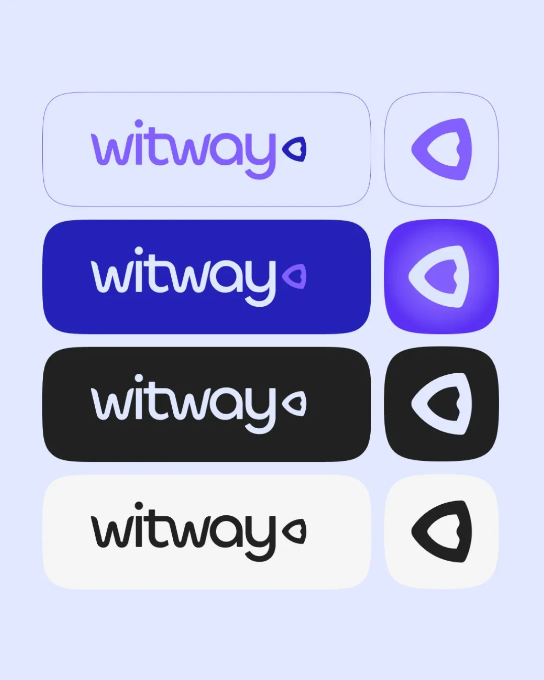
Witway gained a visual identity that connected its product ambitions through one clear idea. The symbol, lettering, and colour system gave the team a consistent way to present the brand while development continued and it prepared to introduce the product.
Read similar case studies

Axiom Breach
Building a credible presence for a new cybersecurity product.
Sojourn Serai
An identity for a longer kind of journey.
Alphatechs
A stronger presence for a cybersecurity company ready to grow.